Offices for the PRO.MED.CS
Jakub Fišer, Kristýna Zámostná
Authors of artworks:Patrik Hábl, Svatopluk Klimeš, Jan Kovářík, Luděk Míšek, Marie Molová, Ivan Ouhel, Aleš Růžička, Dalibor Smutný, Jiří Voves, Olbram Zoubek
Photos:AI Photography
2016
Realization:2017
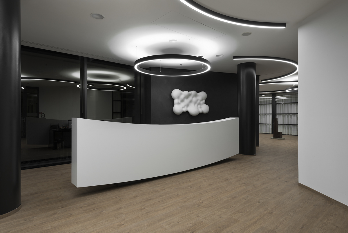
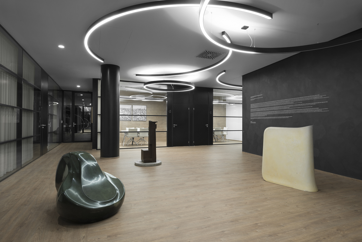
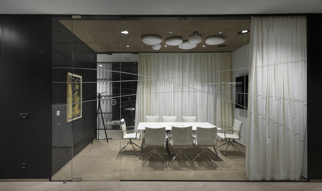
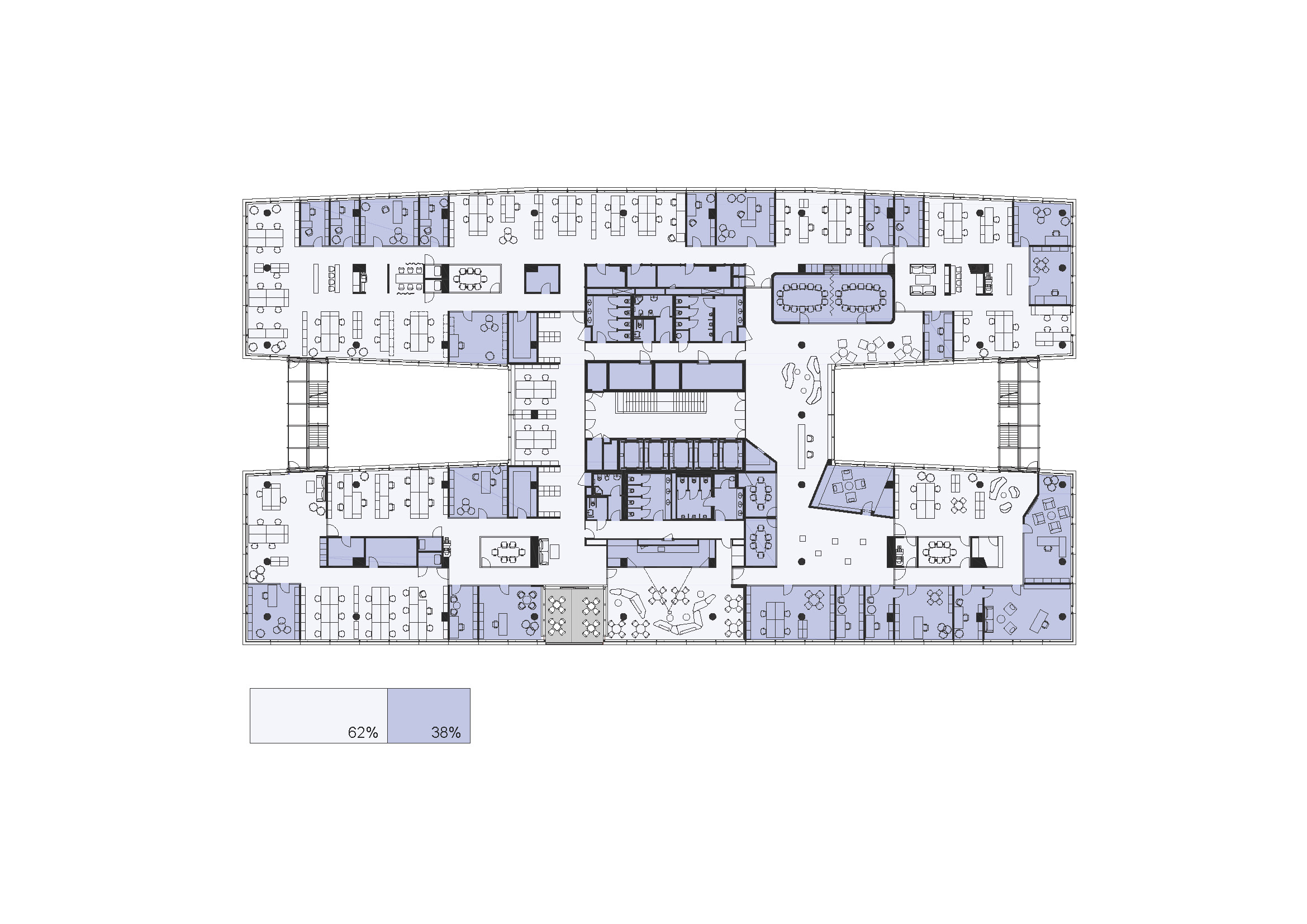
The appearance of offices for the PRO.MED.CZ is our response to the task how to arrange a specific interior for a particular client in a pre-defined environment of an office building for lease. The term “our response” is, however, in this case not that exact. It is rather a result reflecting our joint meeting with the client and the Umělecká beseda (Czech Artists’ forum) – although the one arranged by us.
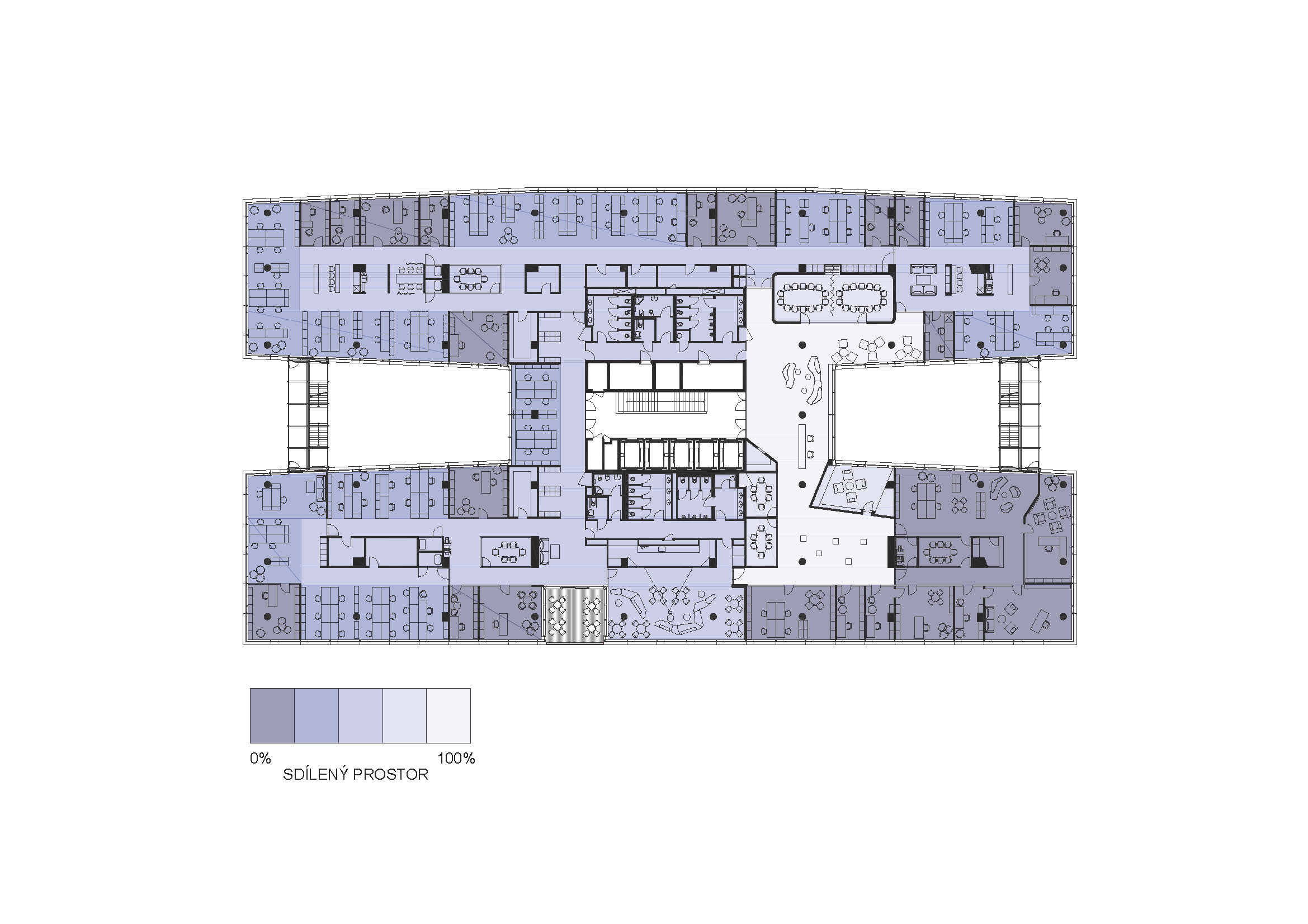
The first phase of the design was long searching for the optimum layout: sizes of workplaces, their mutual relations to meet the needs of the daily routine of the company at the new premises. Moving from the old and entirely different grounds also brings a changed style of work. The routine operation established by the “given conditions” of the old environment had to be distinguished from the actual needs and bonds. All of us had to conduct a patient dialogue. And with layout design, a topic of a concrete design of individual spaces comes up: How should the company’s presentation be adequately expressed? All of us had to conduct a patient dialogue. And with layout design, a topic of a concrete design of individual spaces comes up: How should the company’s presentation be adequately expressed? Discussions go on, and questions are raised: Pomposity or generosity? Experiment or traditional approach? Omnipresent product marketing or culture and style? At this time, we learned about the client’s cooperation with the Umělecká beseda for the first time.
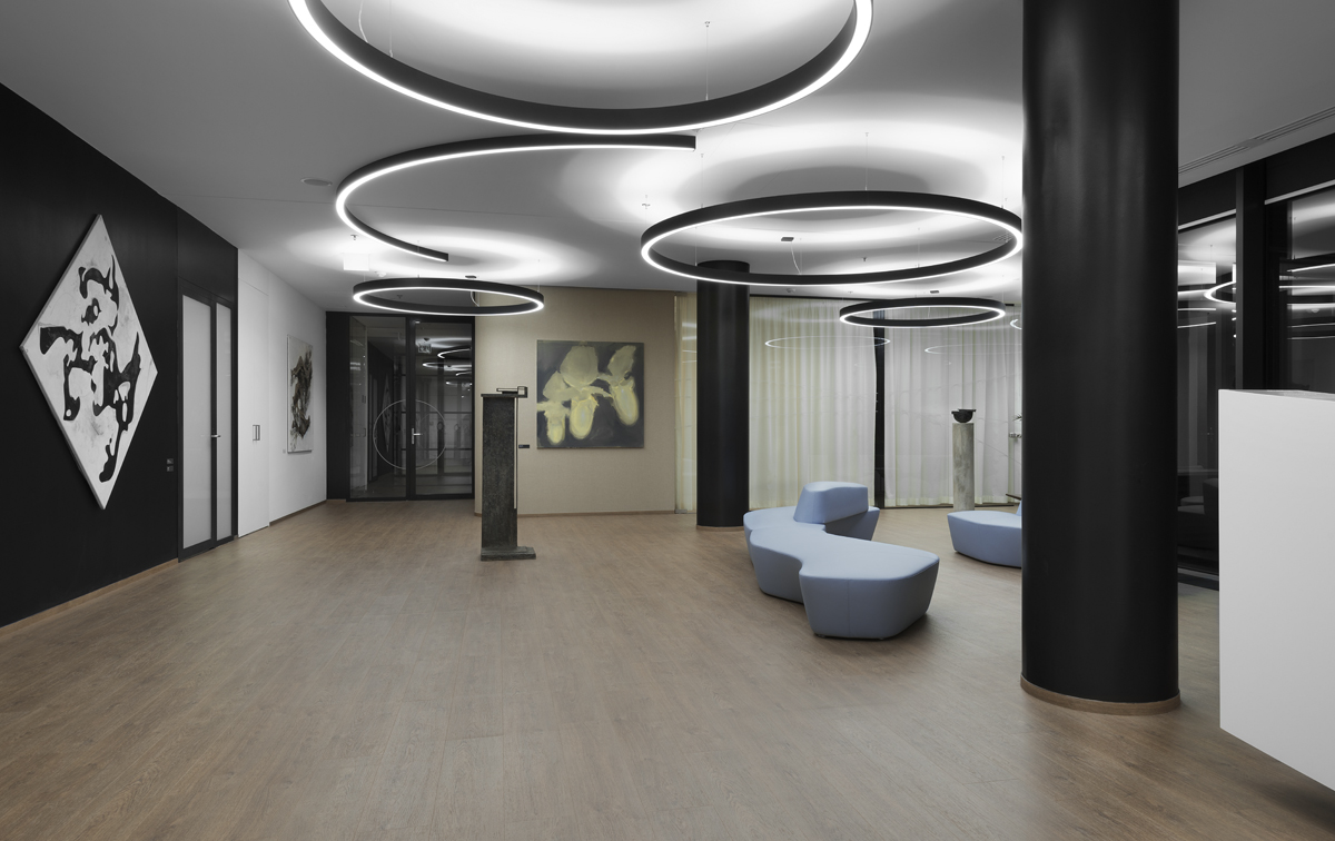
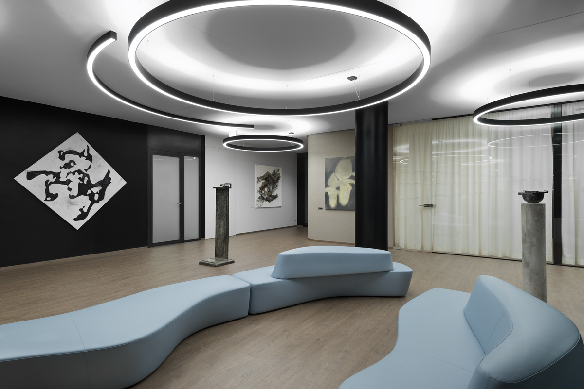
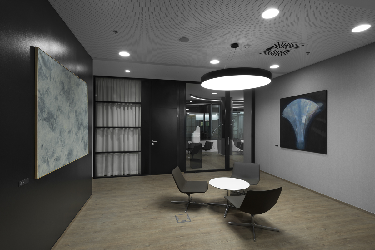
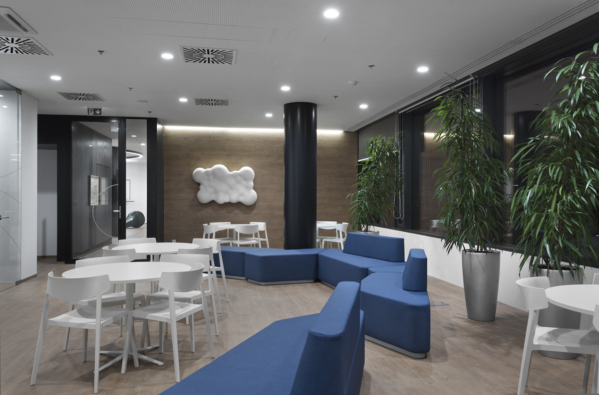
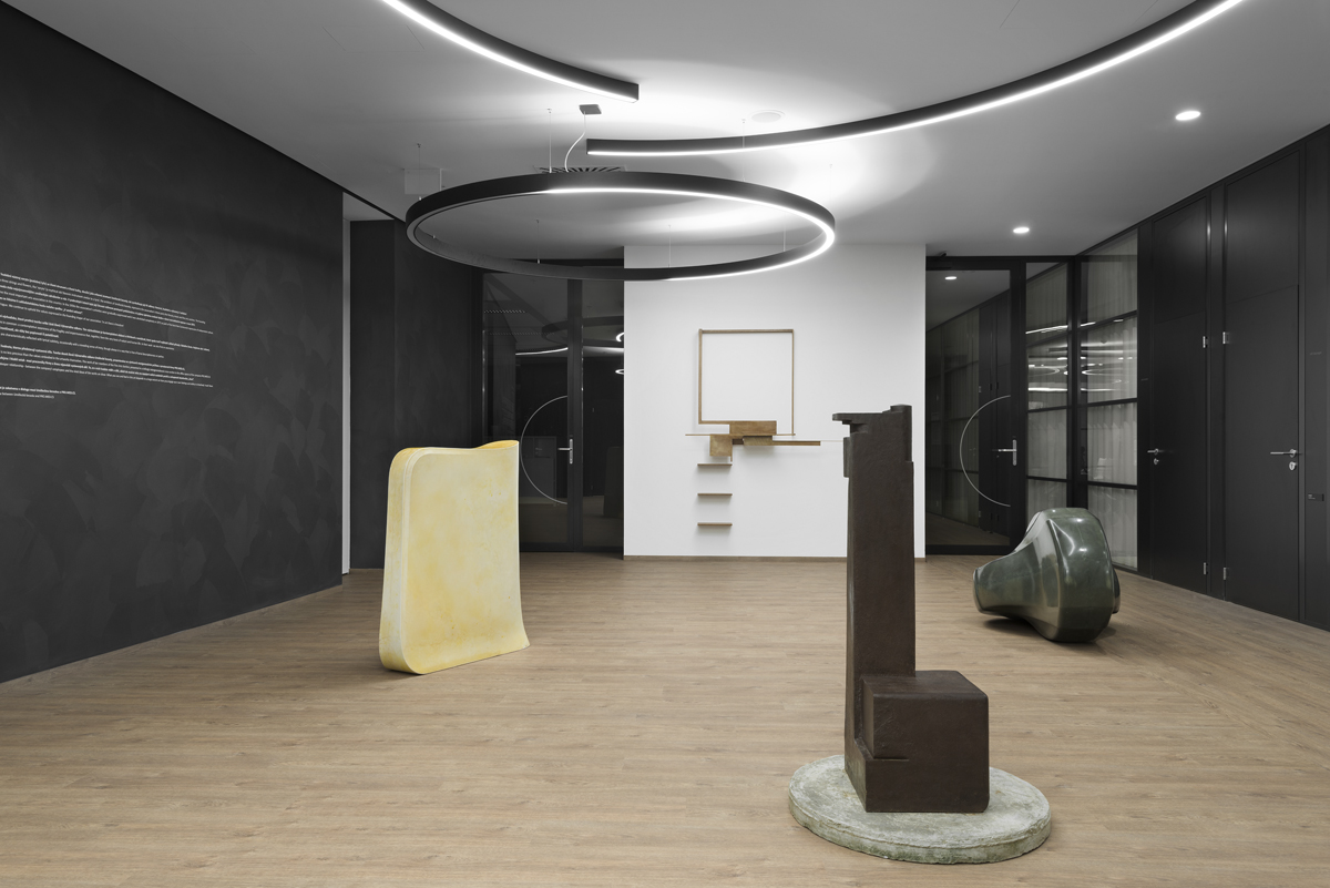
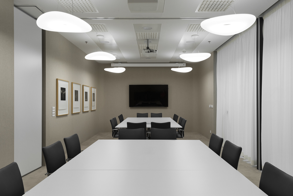
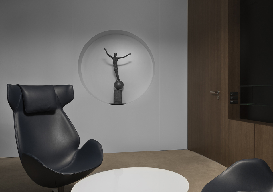
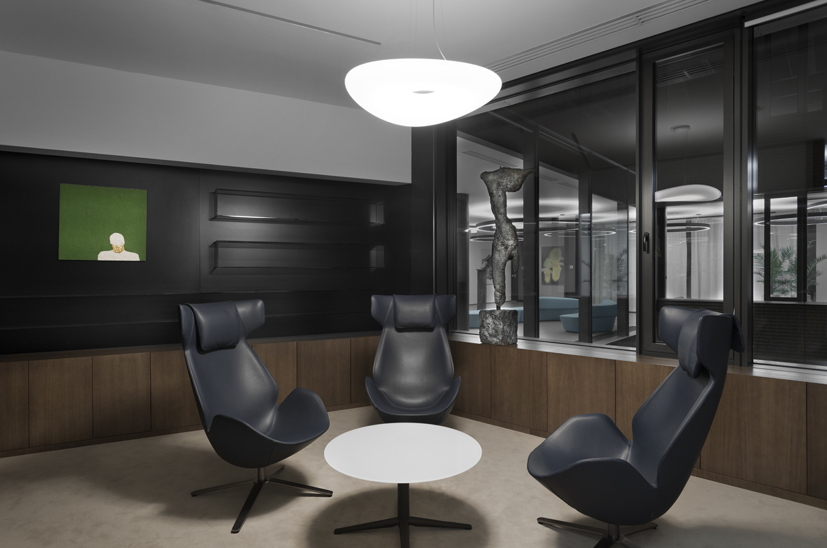
We agreed that artwork of artists represented in the Umělecká beseda would be an inseparable part of the interior. It is logical that the vital time spent over the design was missing within the overall time needed for the execution of the project. That is why we chose standard materials and products already used in the building, if possible. We looked for specifics in the working with modules and proportions; we also opted for a neutral range of colours with respect (not only) to the future installation of artwork. An office environment is dedicated to working, first of all. We did not design a gallery or a one-time exhibition – the interior had to work in its own right.
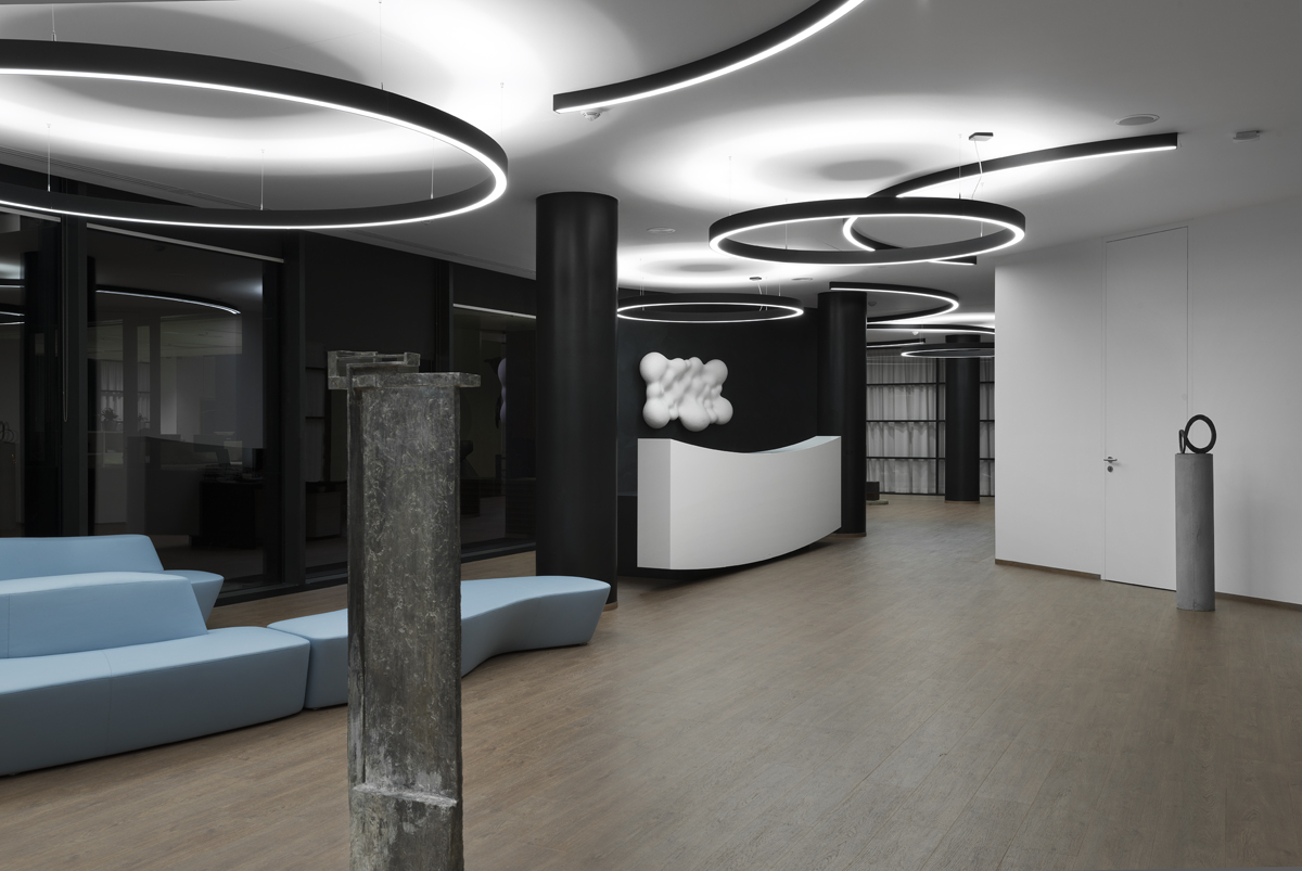
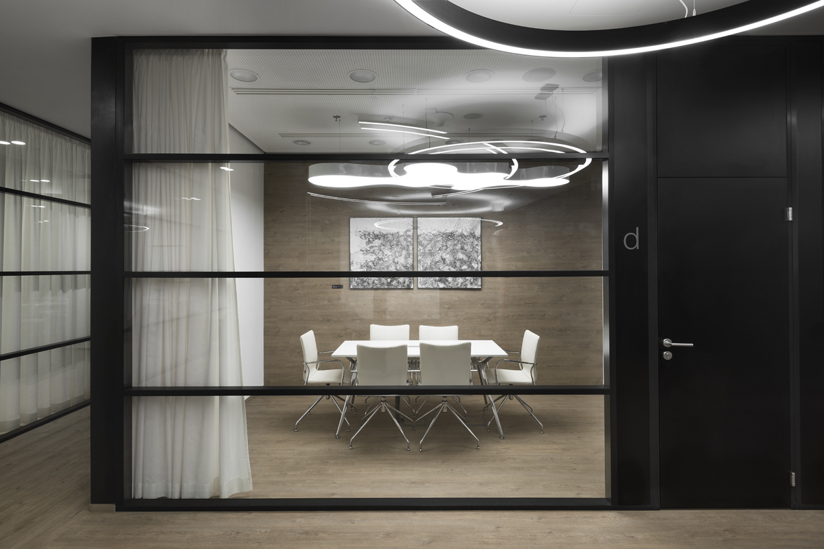
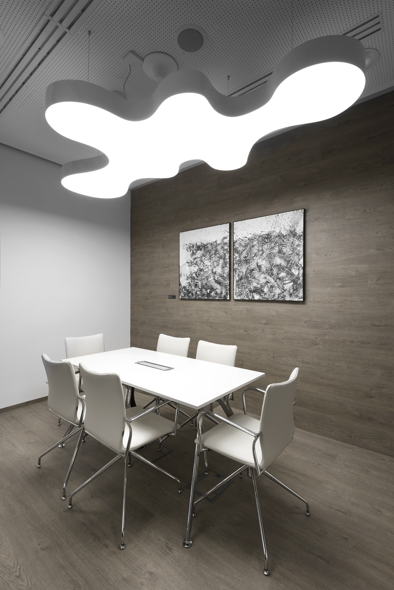
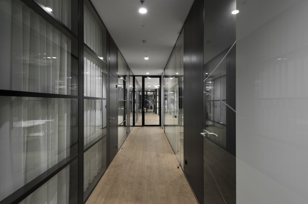
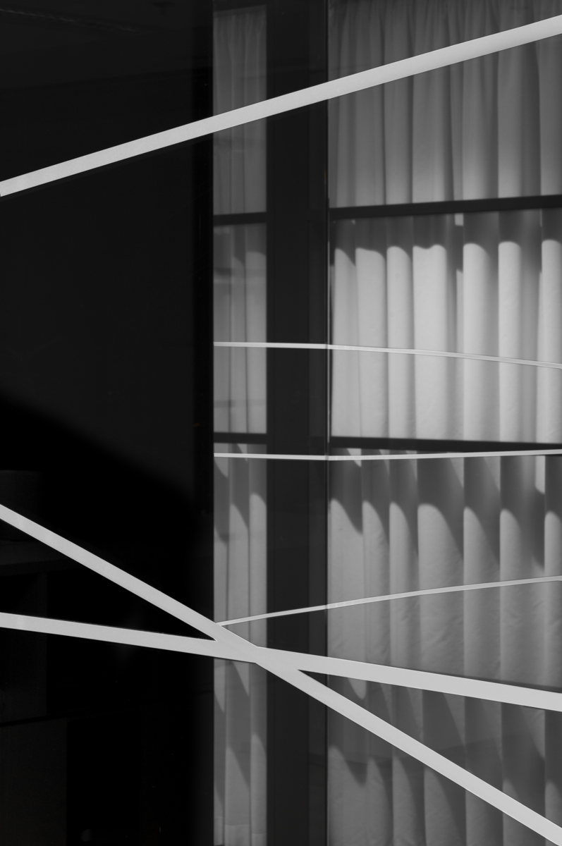
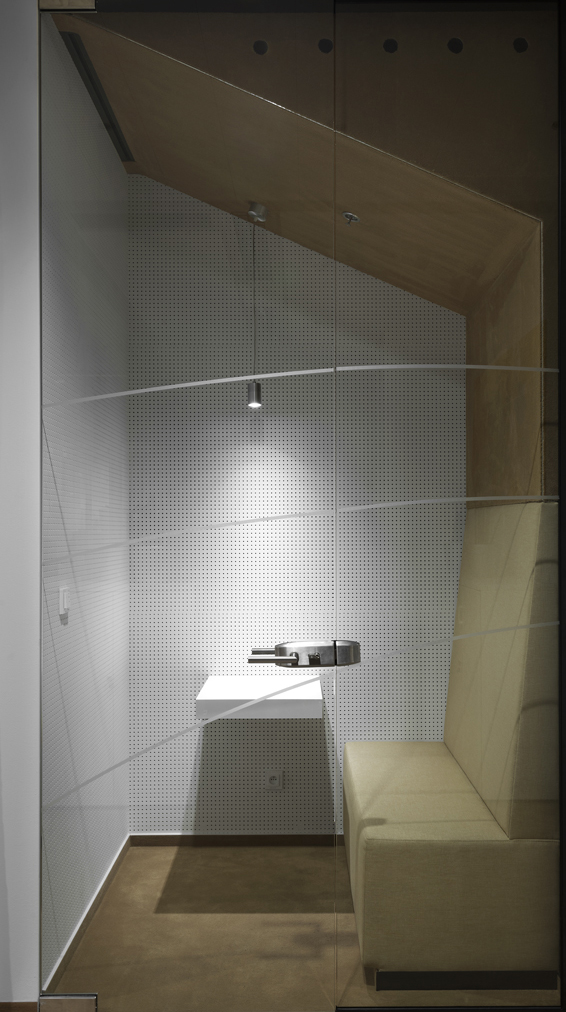
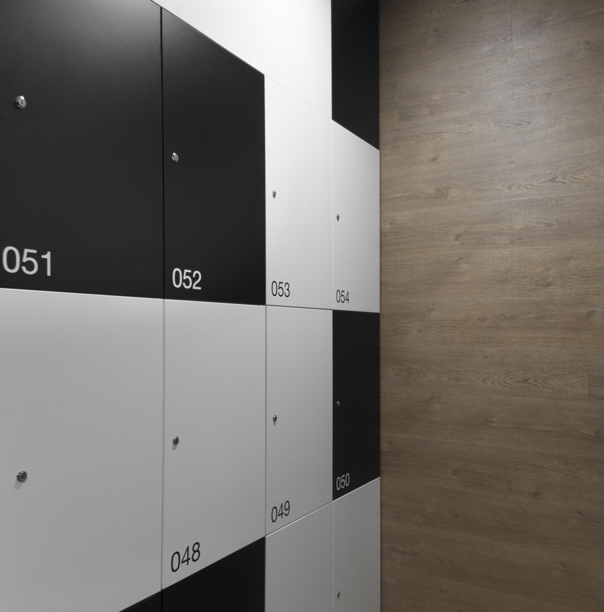
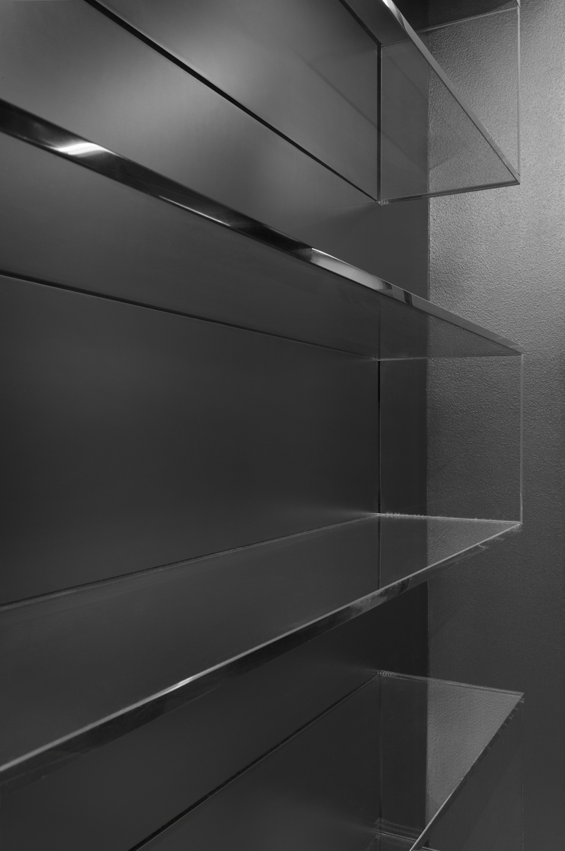
In this design, we balance strict geometry of lines and joints based on the modulation omnipresent in the building by solid undivided areas, round shapes, by curves of light fixtures. Light wood, that is its imitation in the form of vinyl floors in our case, introduces necessary balance into the office environment of rather technicist or “cool” character regarding materials given by its substance/origin. Its reminder also has another reason in this particular case – we understand it as a symbol linked with the phenomenon of interiors of historic pharmacies. A black patinated or glossy screed is used as complementing not only because of its spatial effect and as a corrective, but it is for us a sign of elegance, representation; perhaps even a hint of some mystery linked to pharmaceutics. Everything is accompanied and affected by the initial idea that artworks will play a featuring role within the whole.
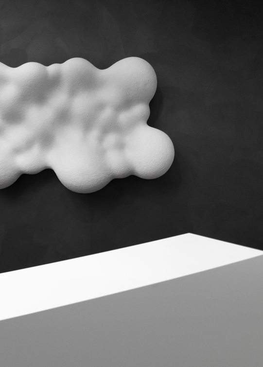
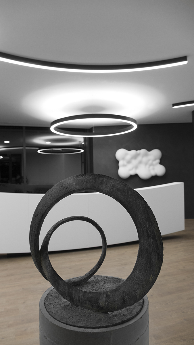
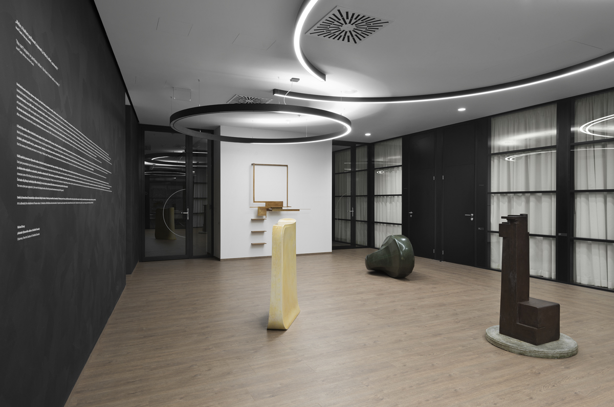
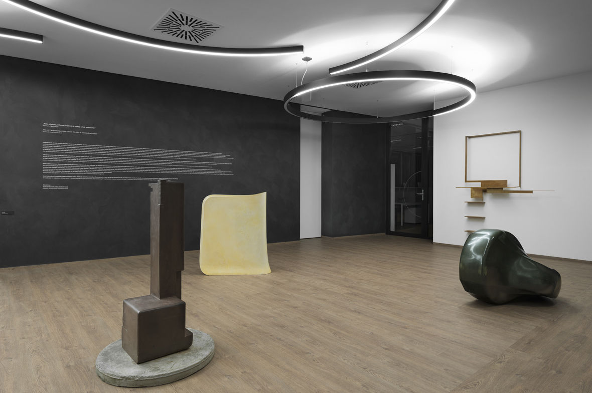
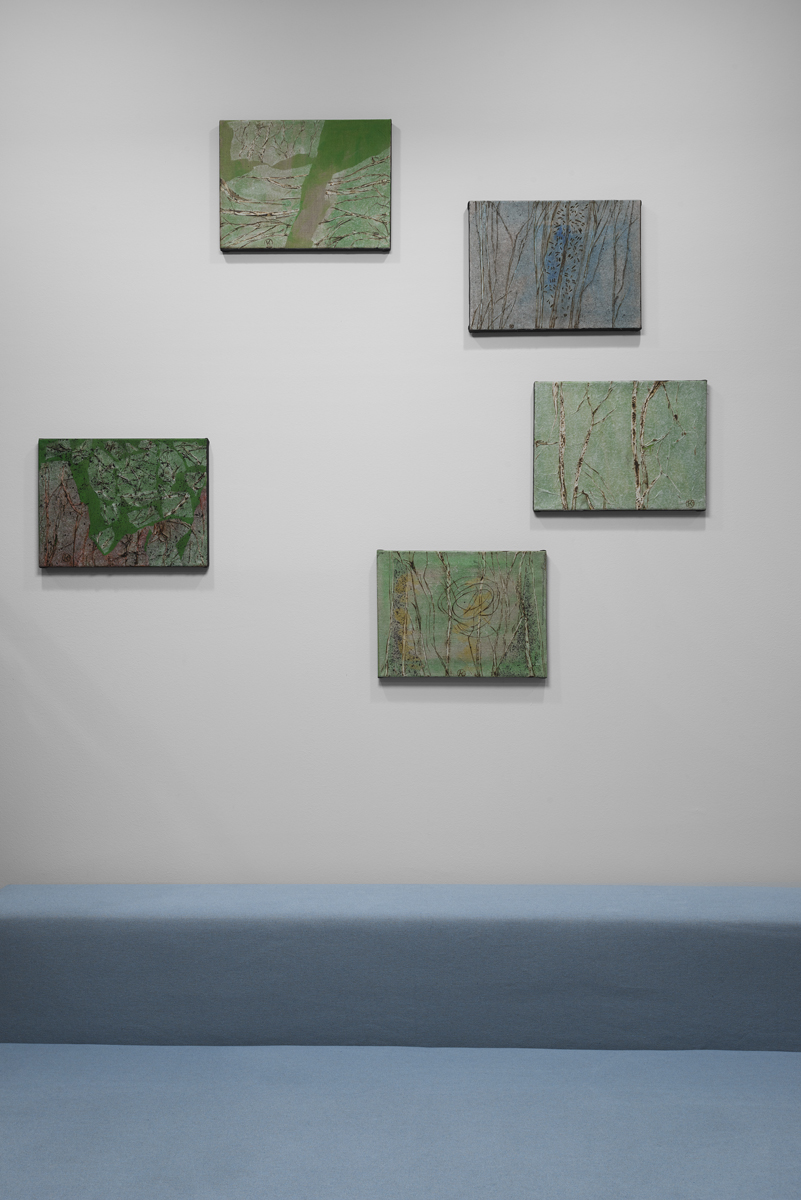
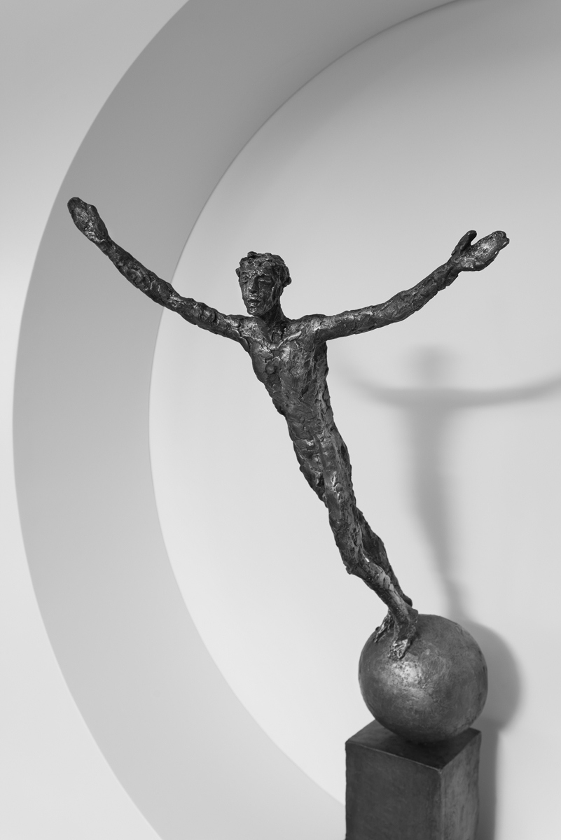
Two reasons made us accept this idea: the first one was the conviction that architectural expression per se cannot adequately represent the role of artwork or replace it; that one is complemented and accompanied by the other as part of the culture from time out of mind. The second reason – in this consequence the less substantial one – was the question of the before-mentioned representation. A successful company does not necessarily have to present its products in its premises; let it display its style – its culture. As PRO.MED.CZ is a donator to Umělecká beseda, furnishing its interior with artworks of artists represented in this association is an obvious consequence of its activities. When construction work was coming to an end the next step was to select particular pieces of art and prepare the installation.
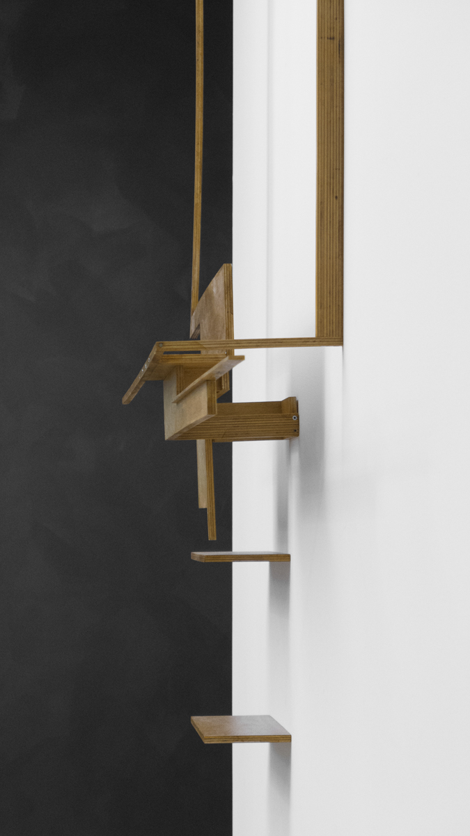
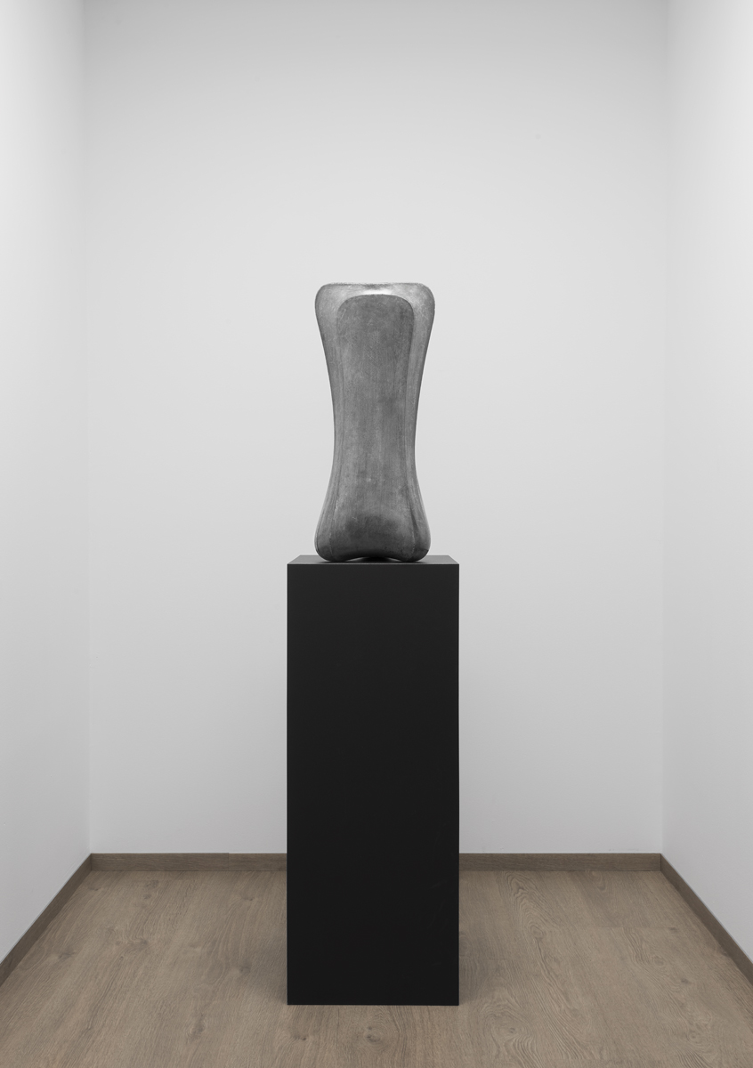
Together with other colleagues from the realisation team, we spent unforgettable moments visiting the ateliers of artists who gave us a warm welcome. Although we selected from already existing pieces of art and not works created for a specific architecture, we saw plenty of symbolism in artworks of members of the Umělecká beseda on which we built as far as was reasonably reachable in the context of an interior built into an existing environment of a universal office building for lease, too. If we try to summarise these intersections into several words, these are Humanity, Nature, Purity. Words and from them developed symbolism are logical in the context of a pharmaceutical company PRO.MED.CS the same as its cooperation with the Umělecká beseda.
