Vinotéka RED Pif
Jakub Fišer, Petra Skalická
Developer/investor:k4wines s.r.o.
fotografie:AI photography
2010
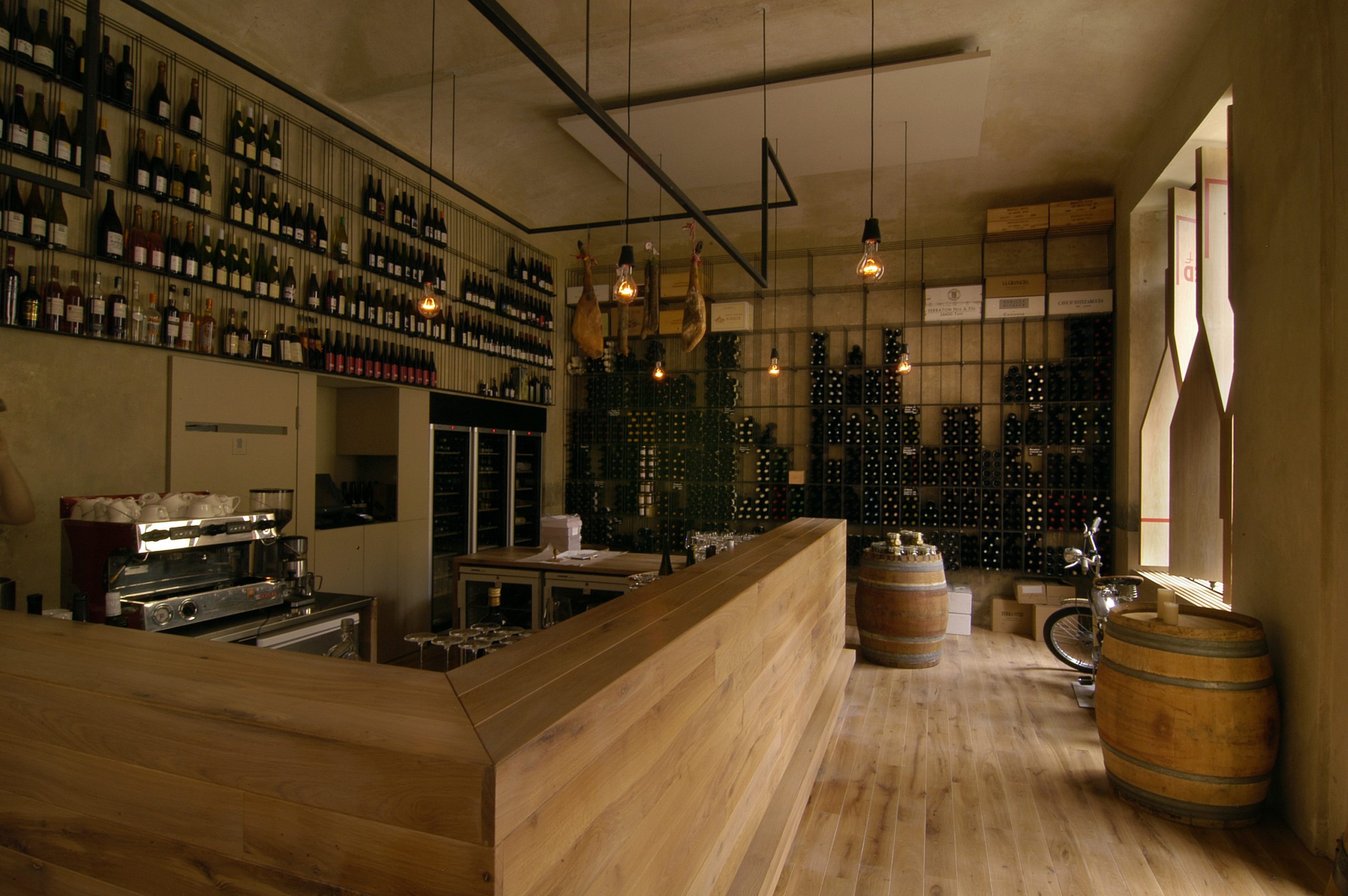
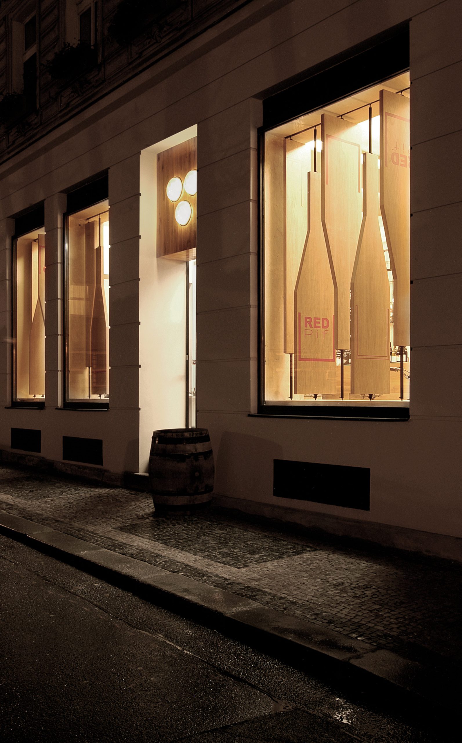
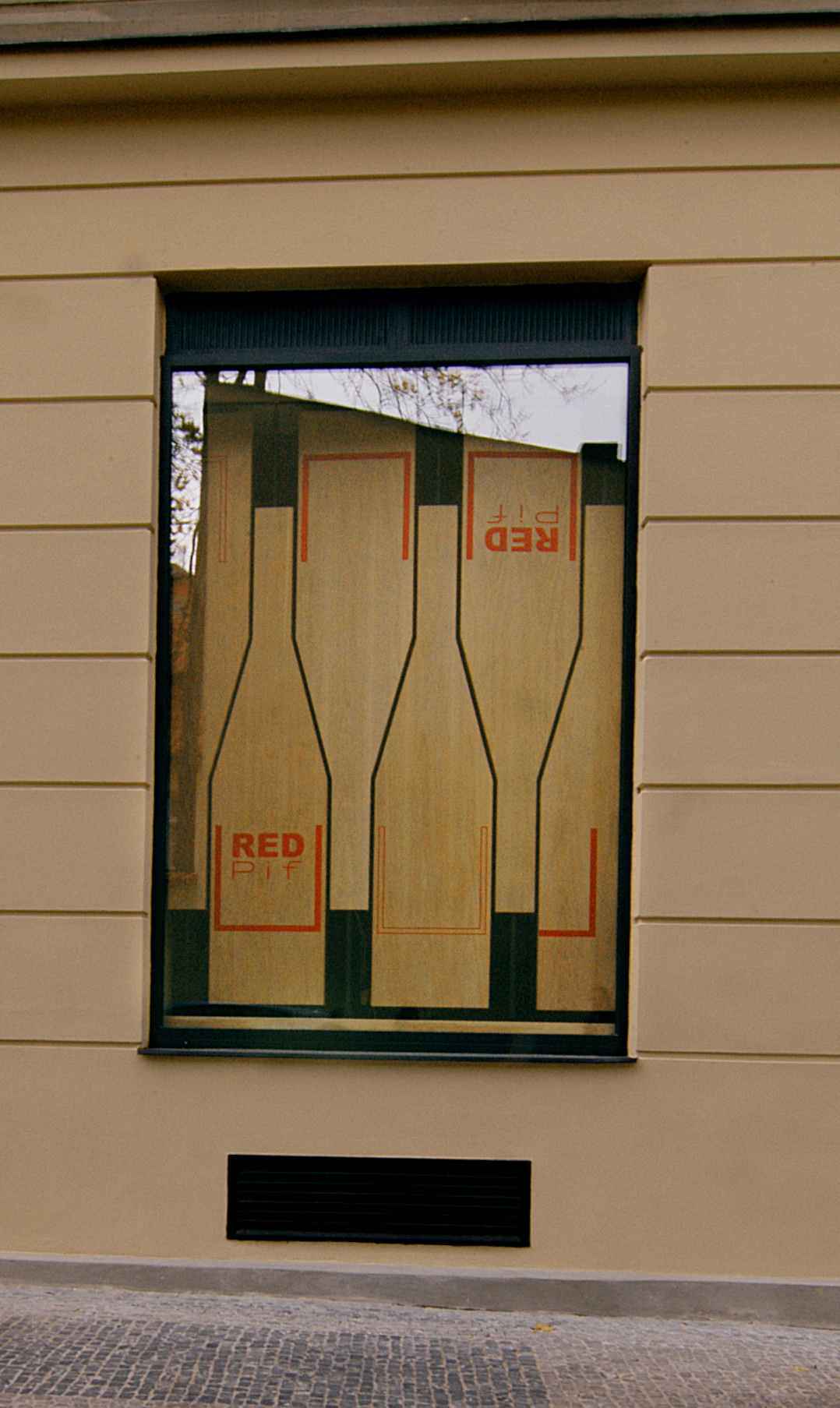
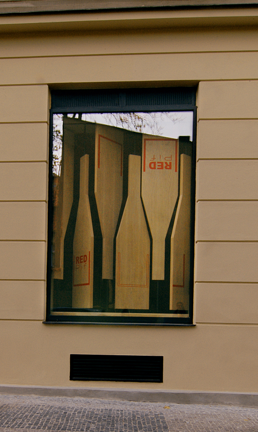
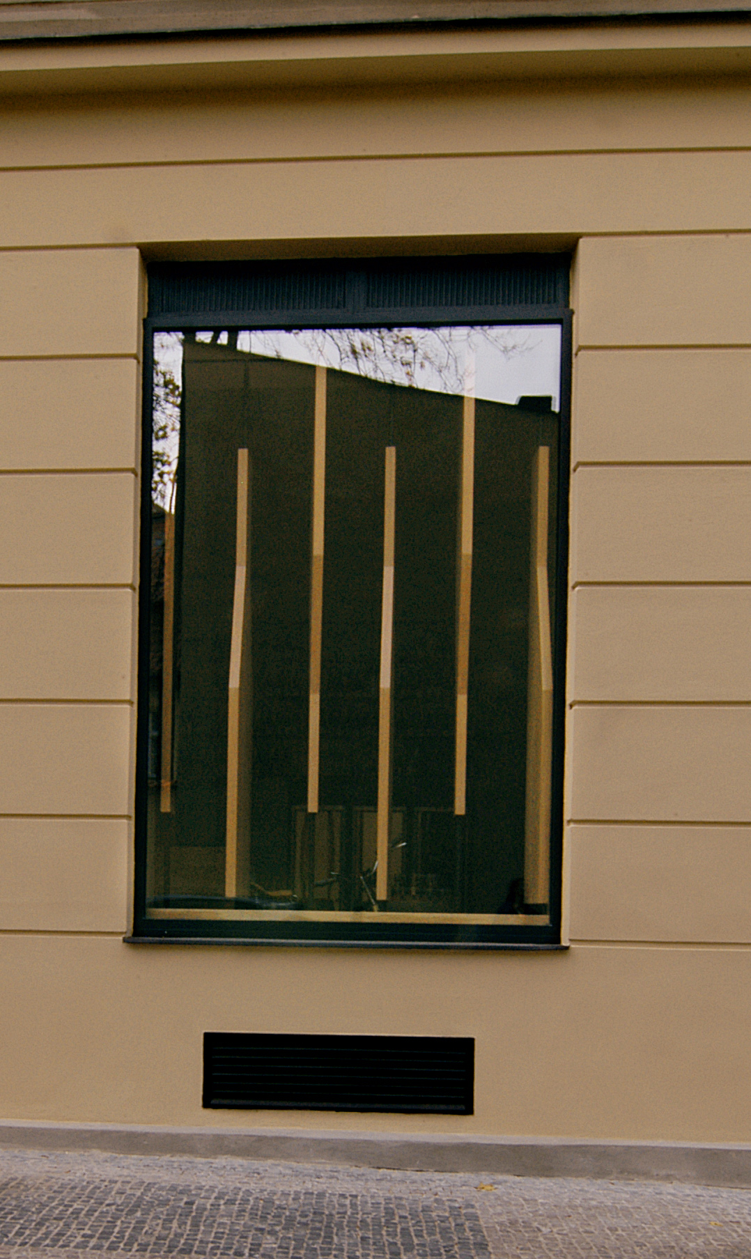
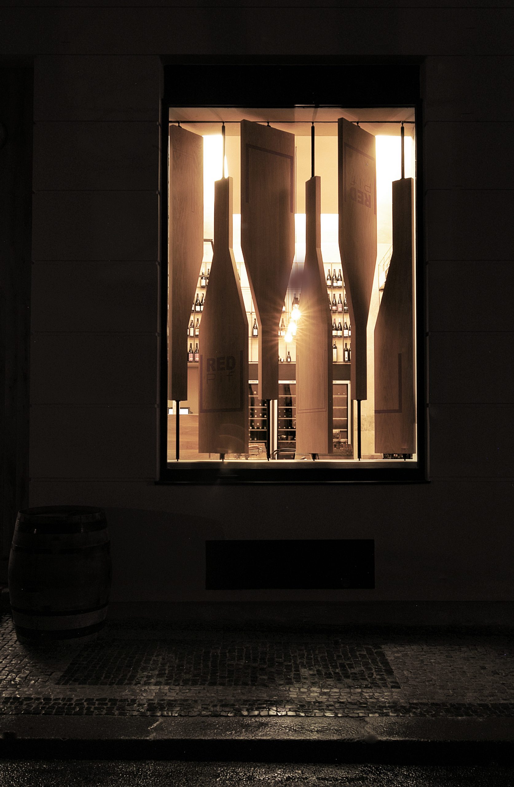
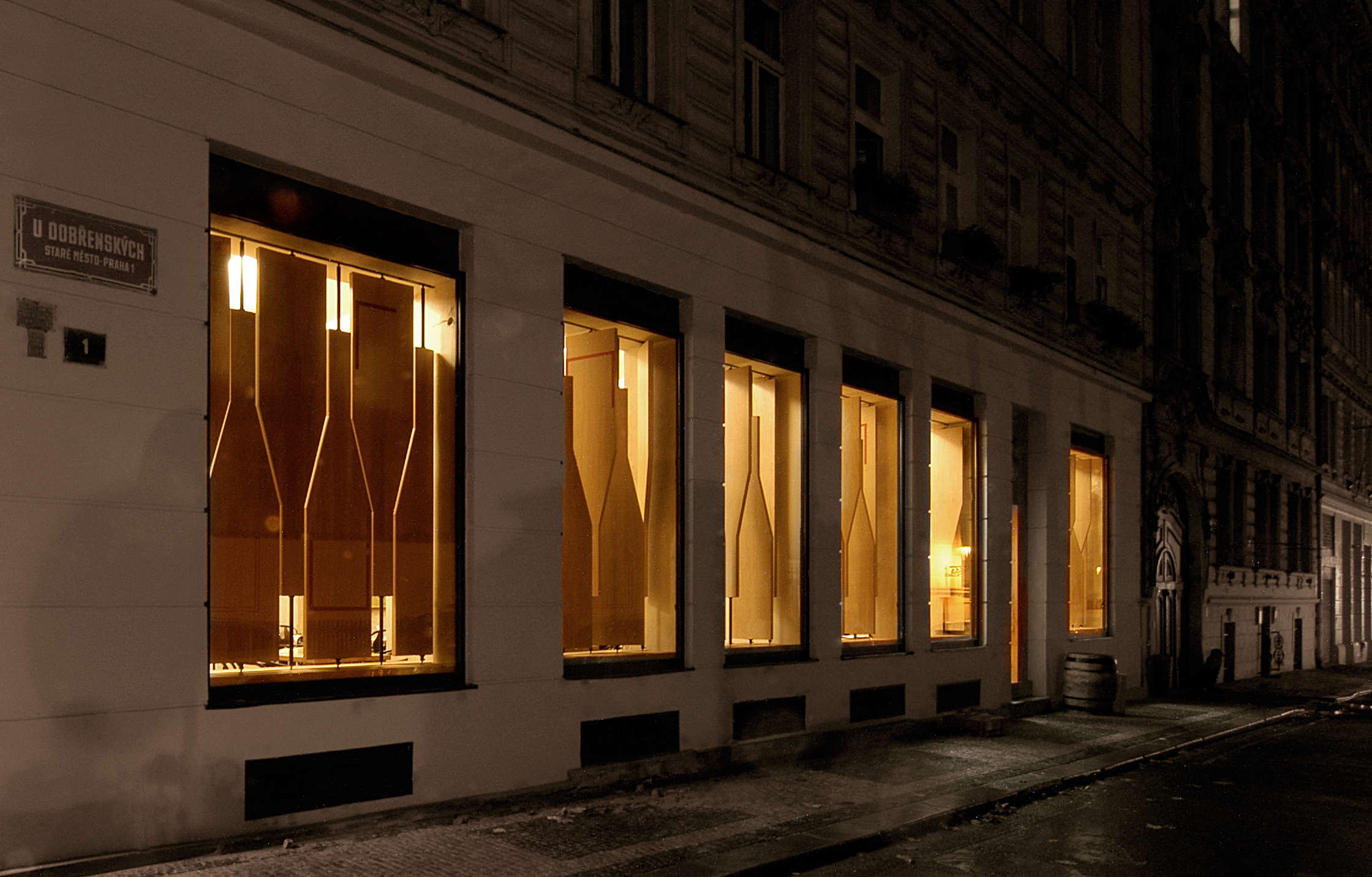
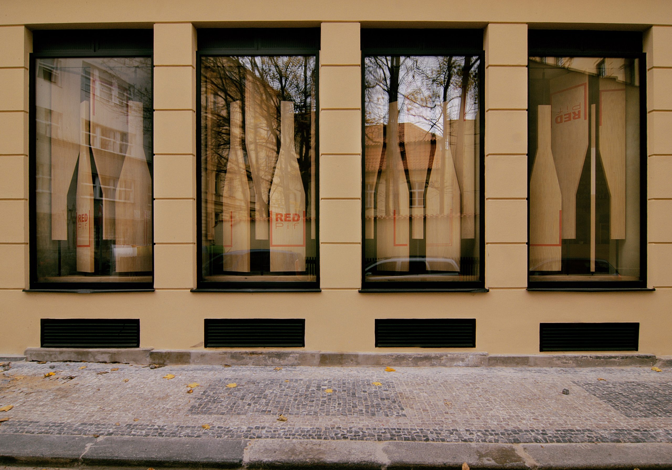
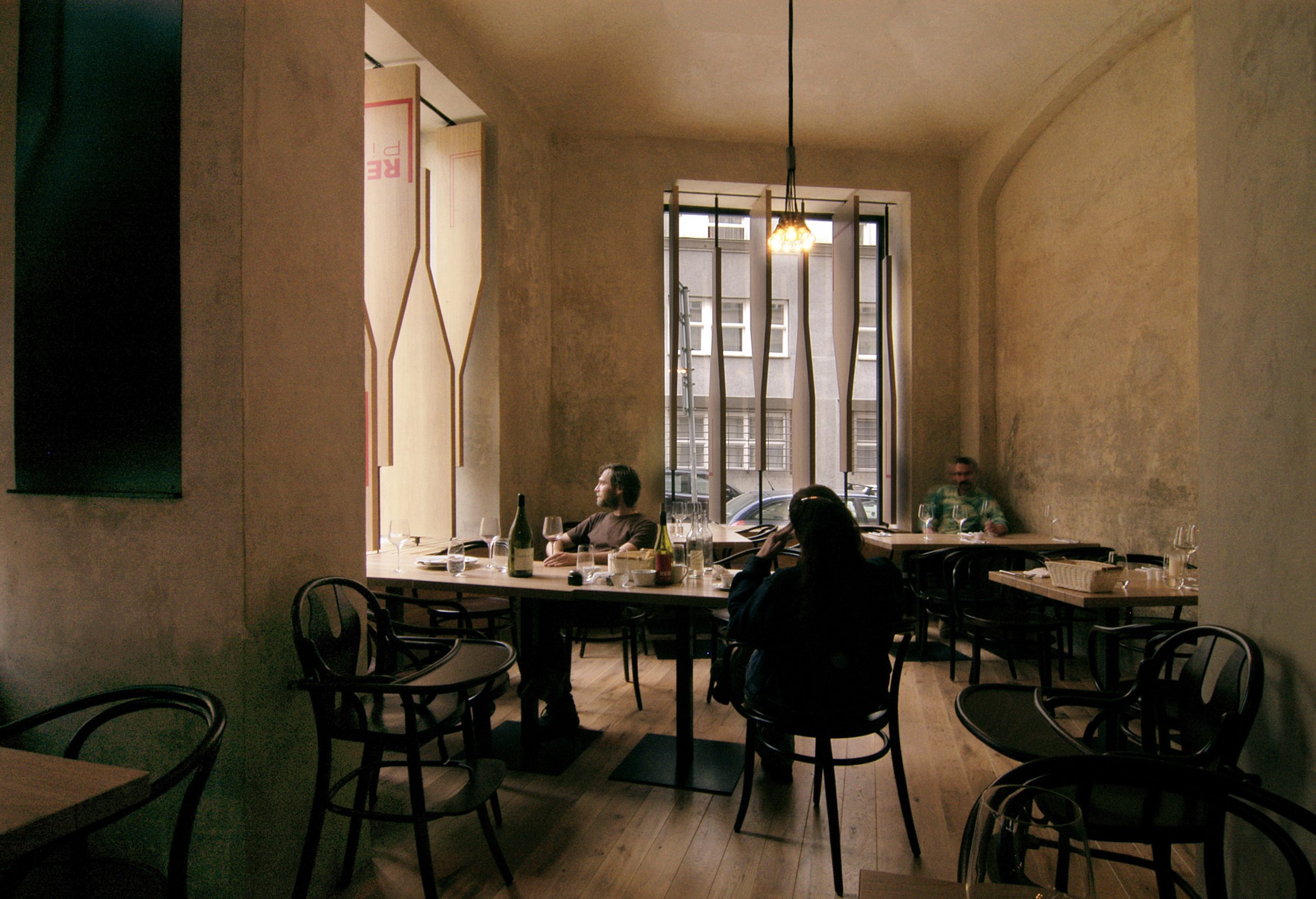
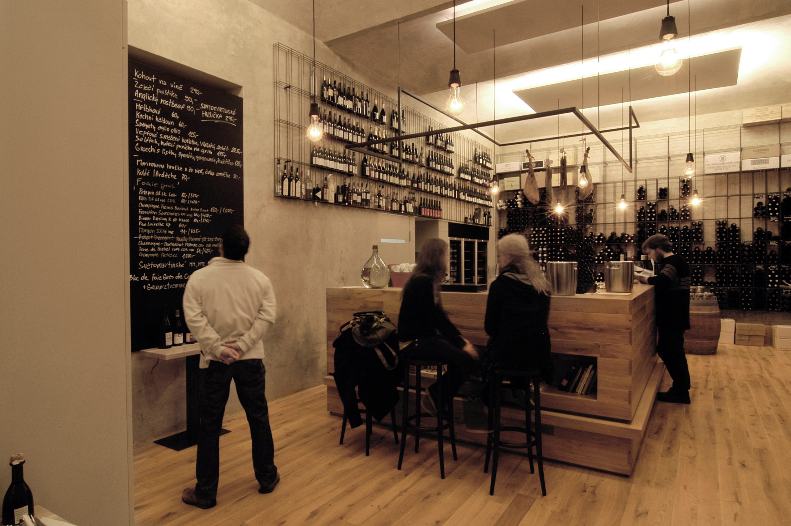
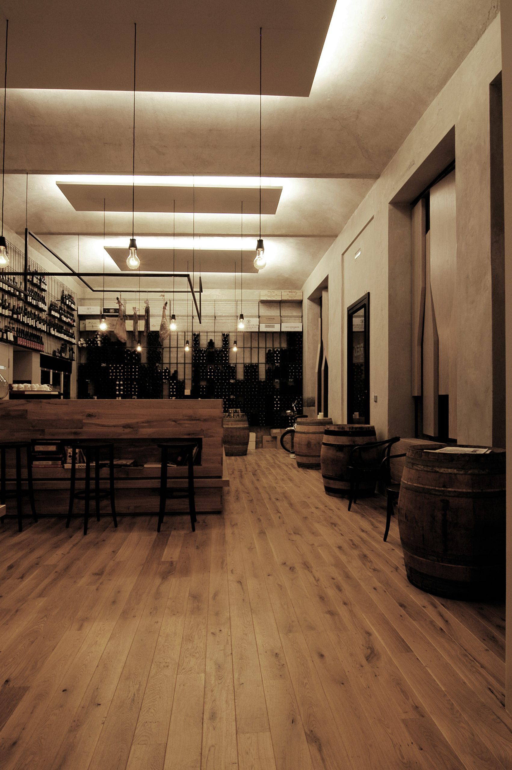
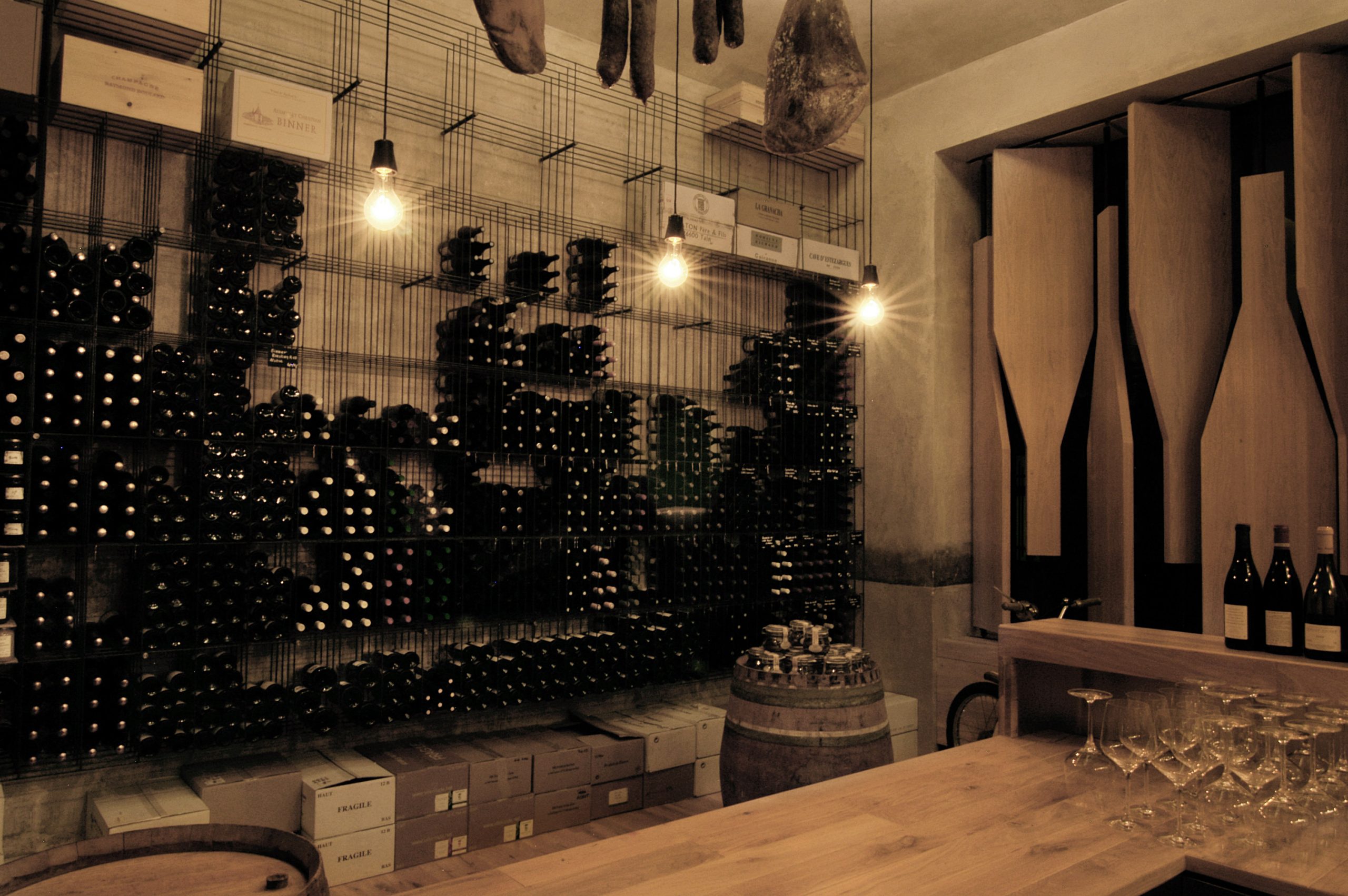
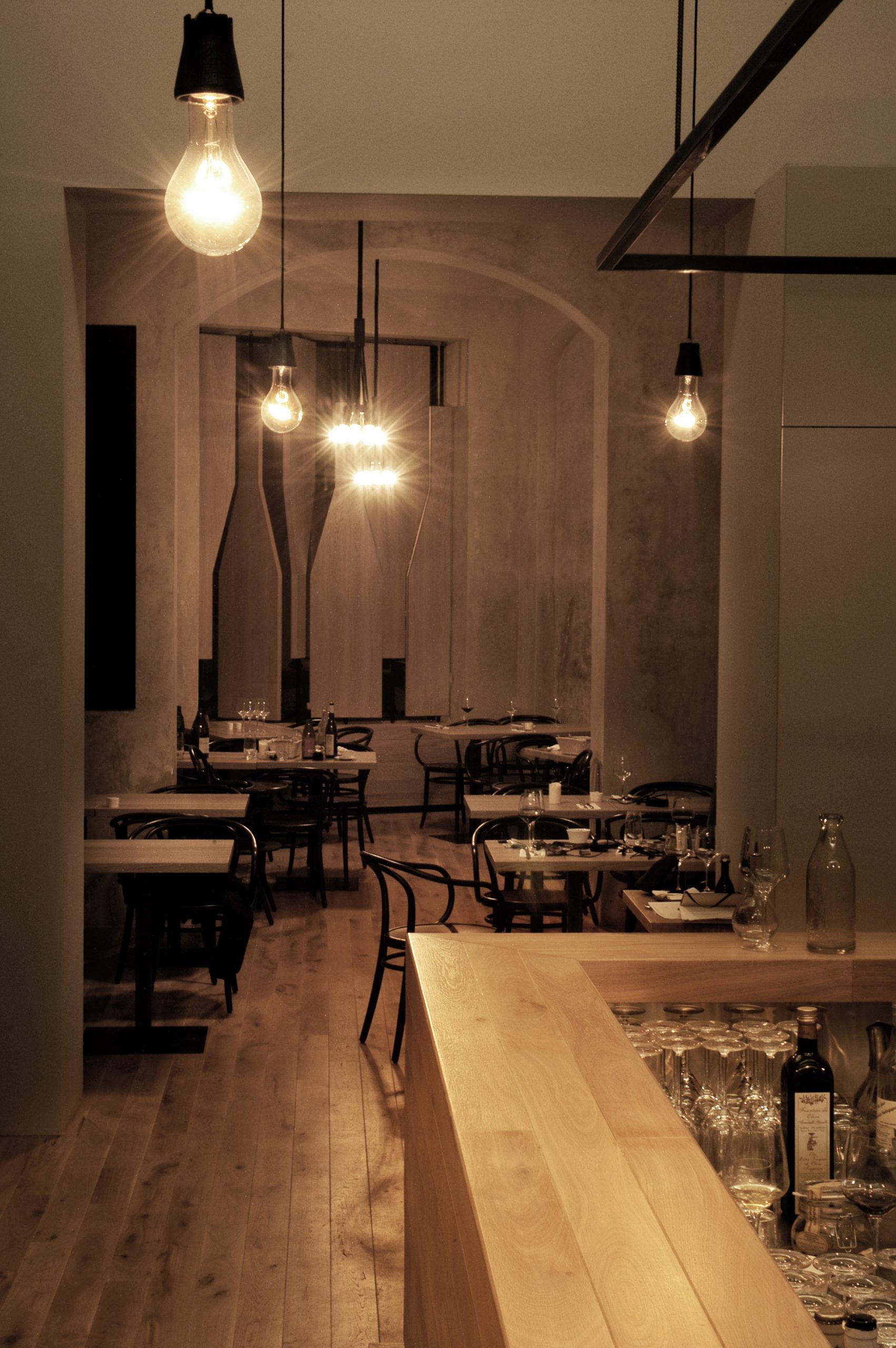
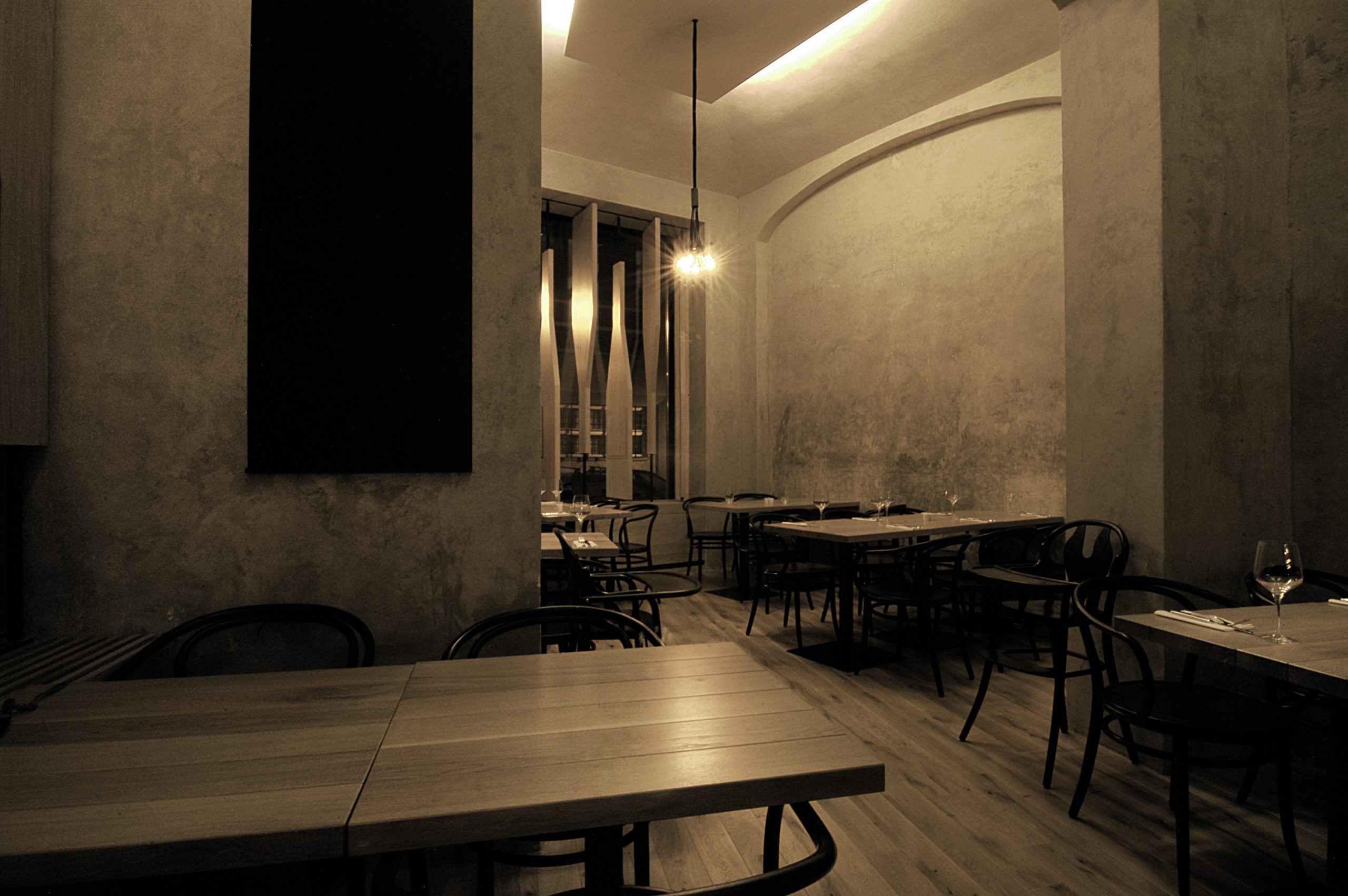
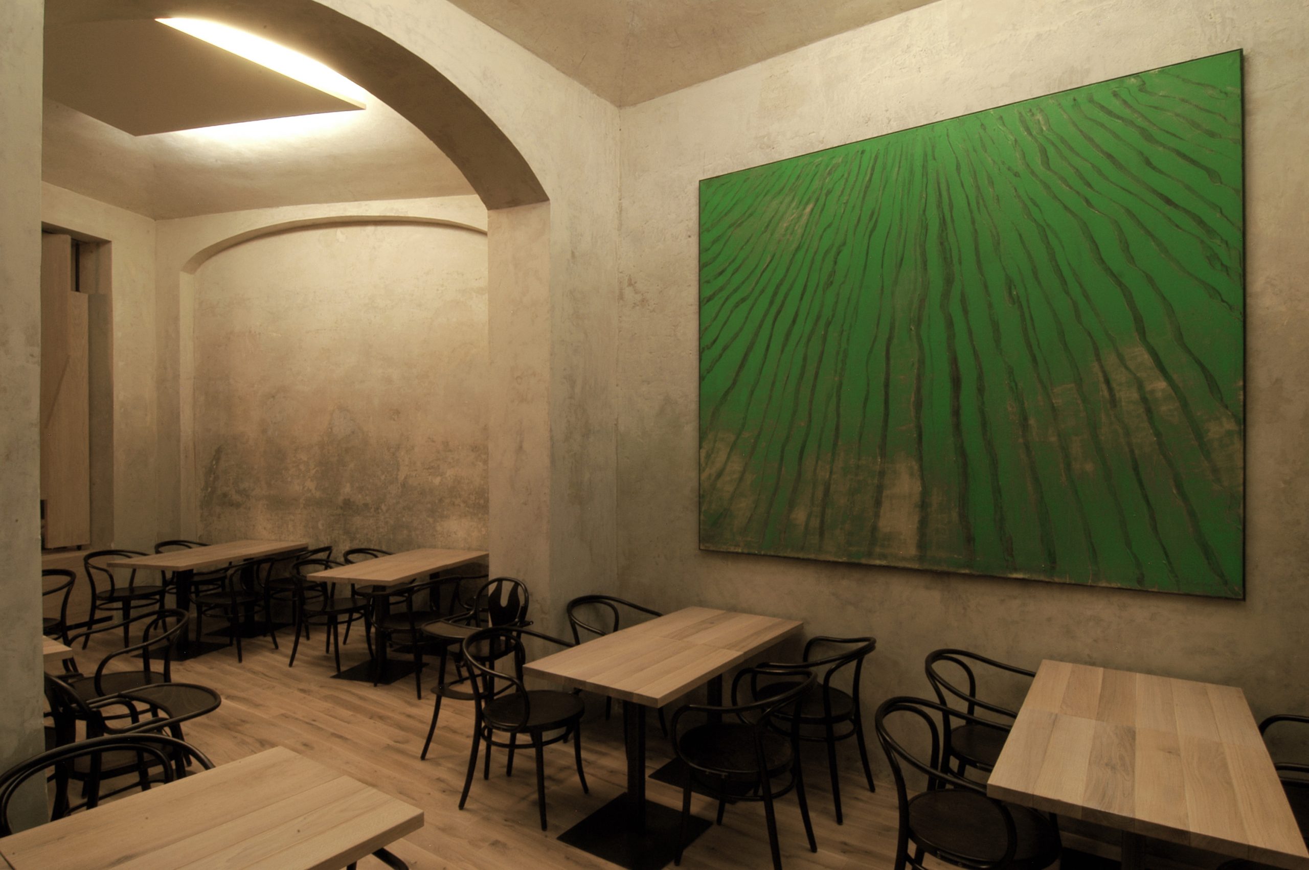
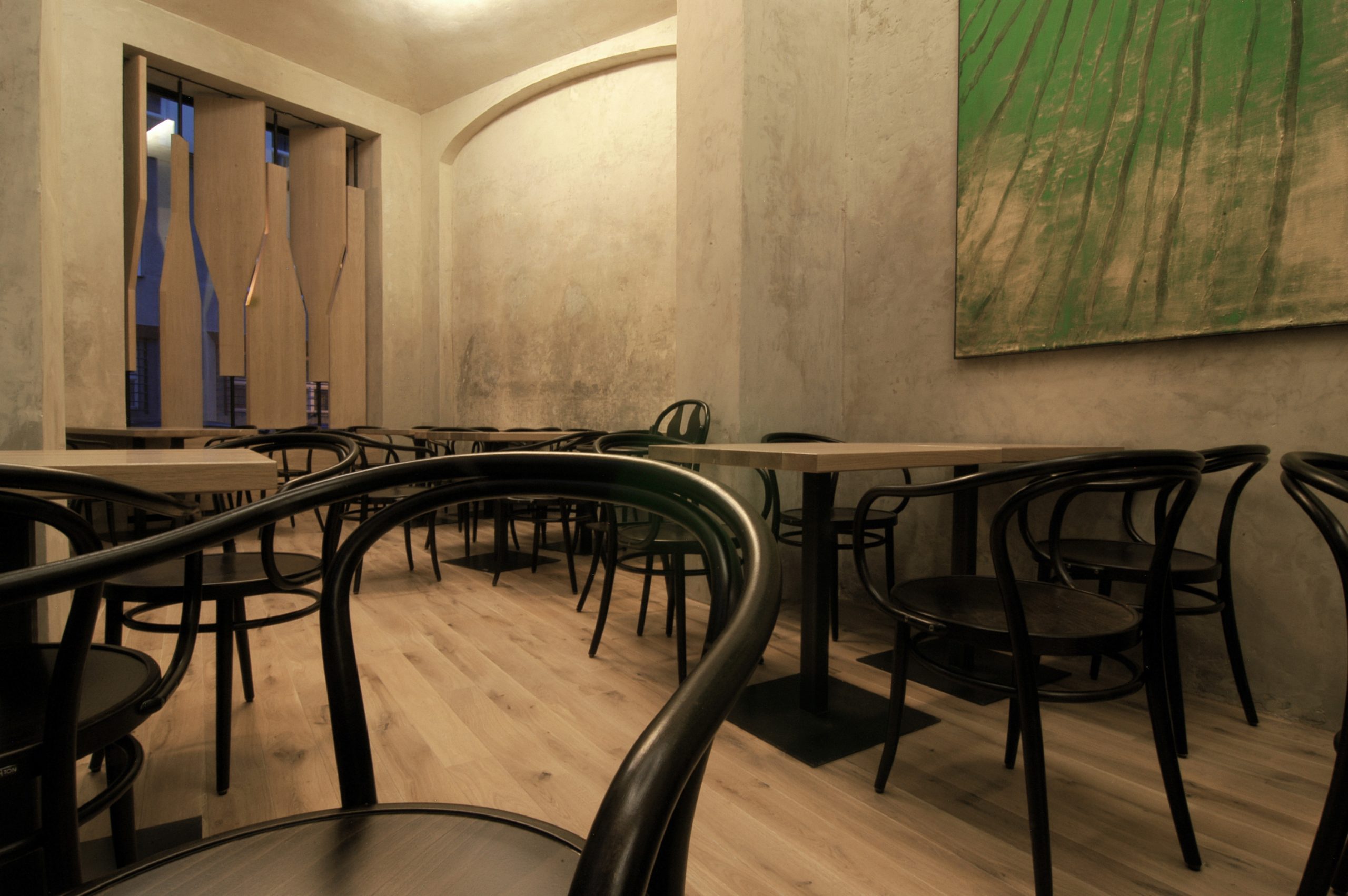
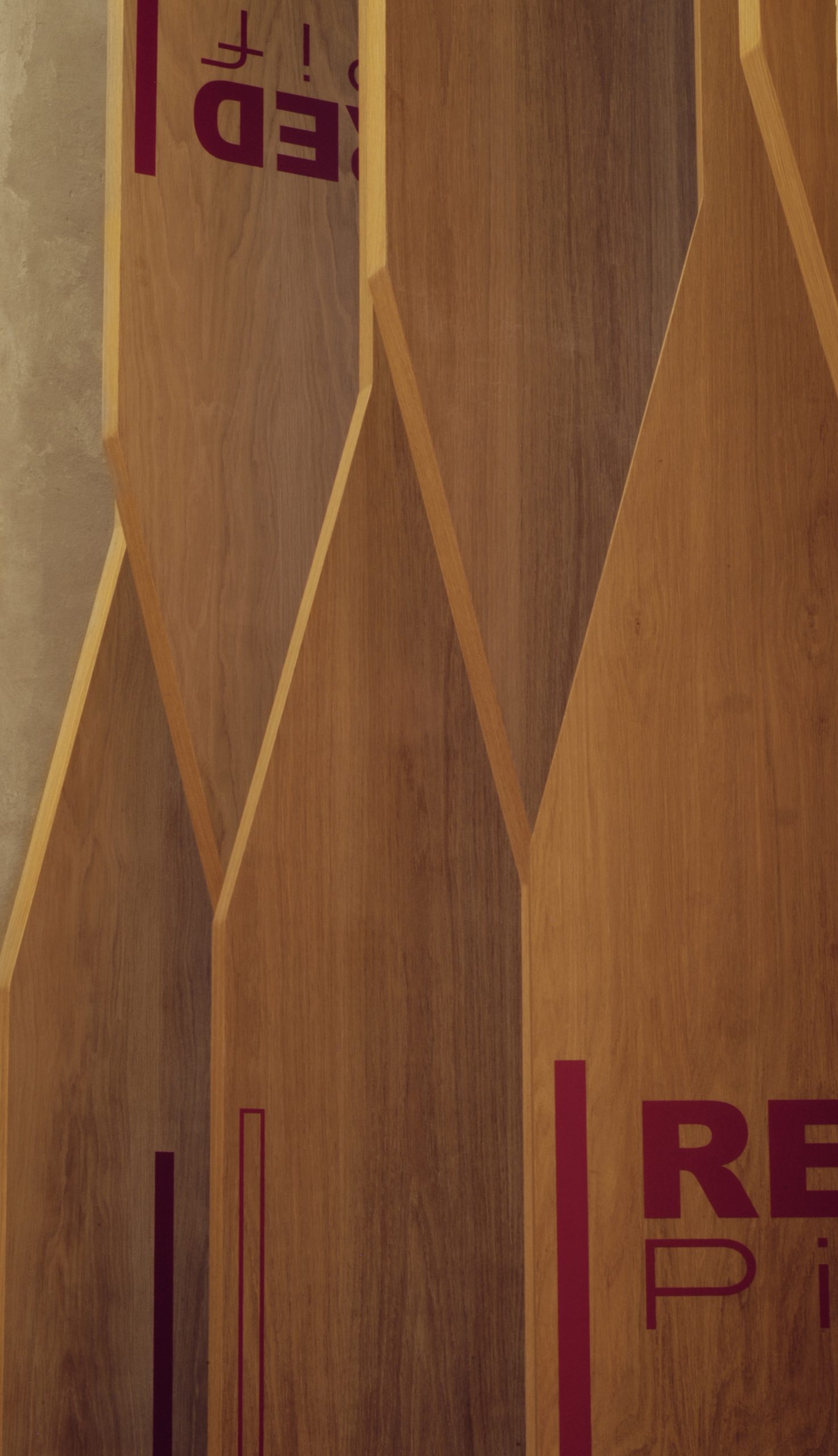
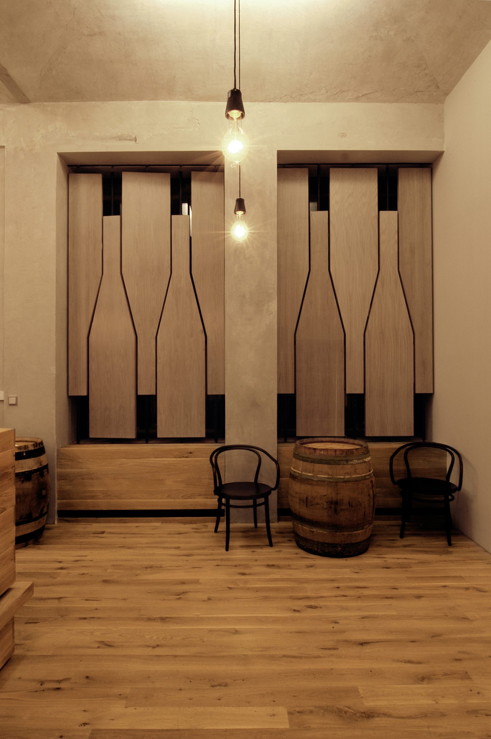
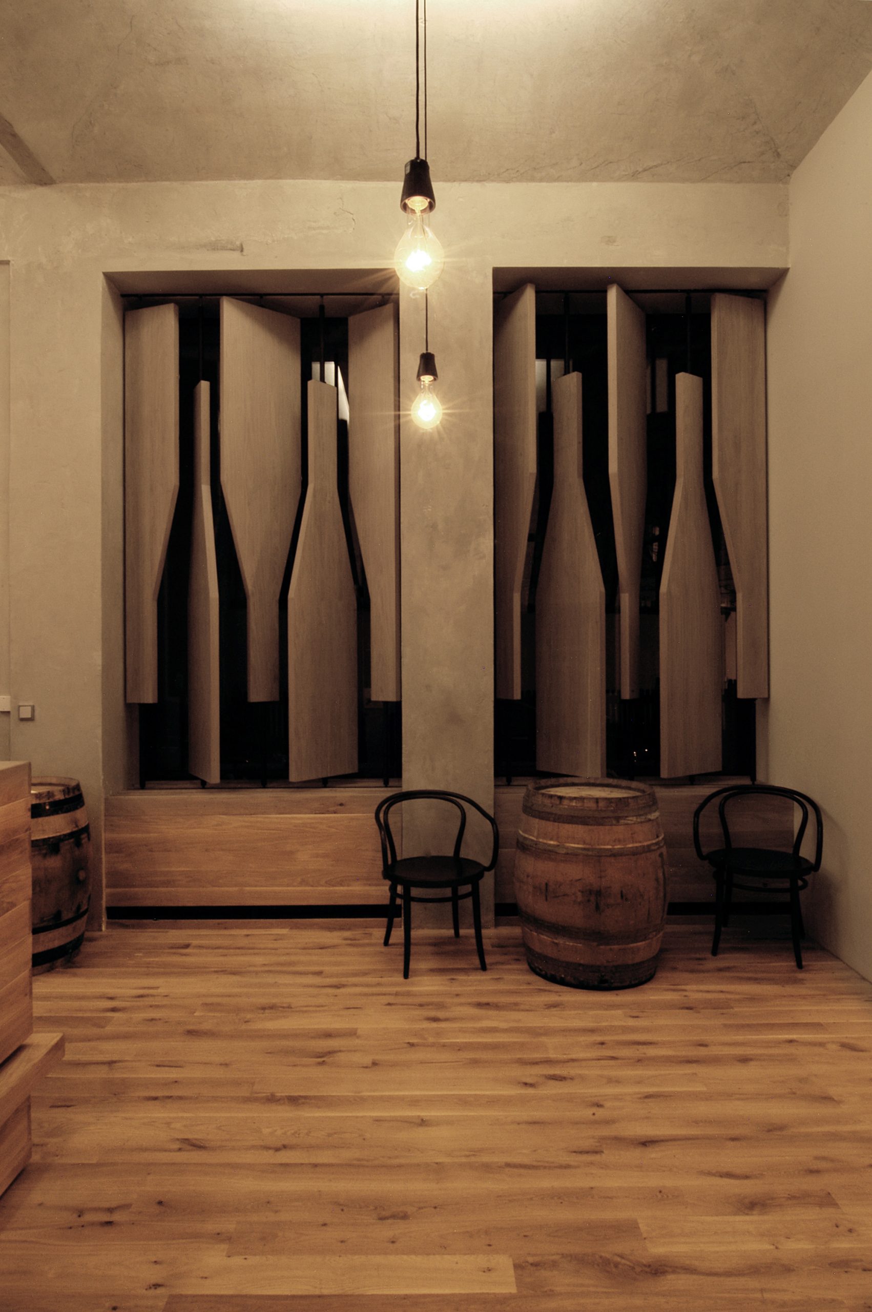
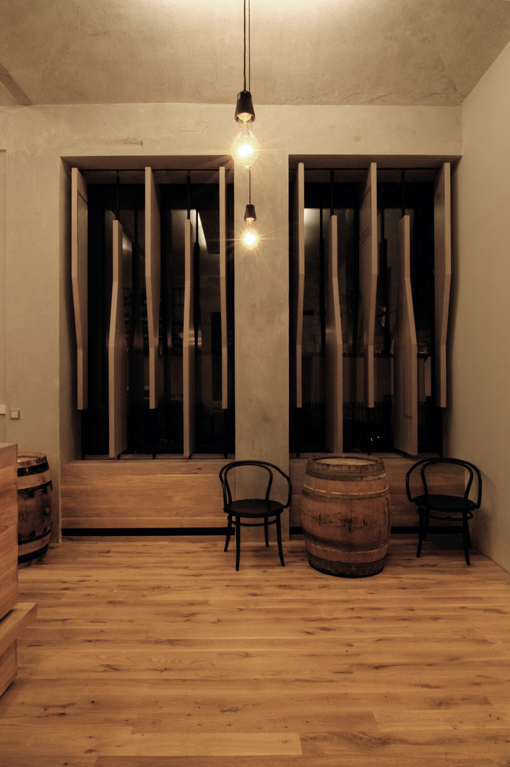
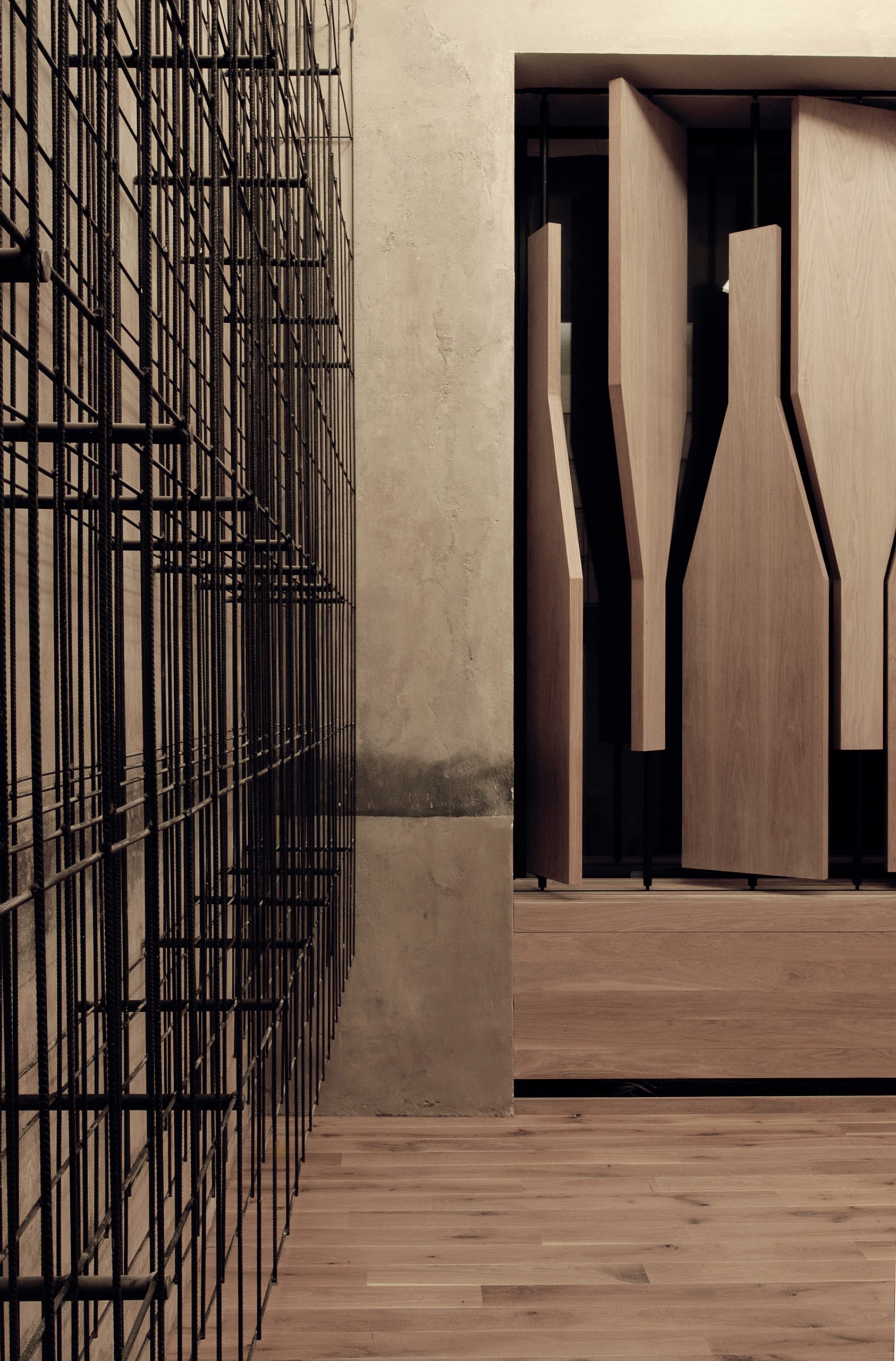
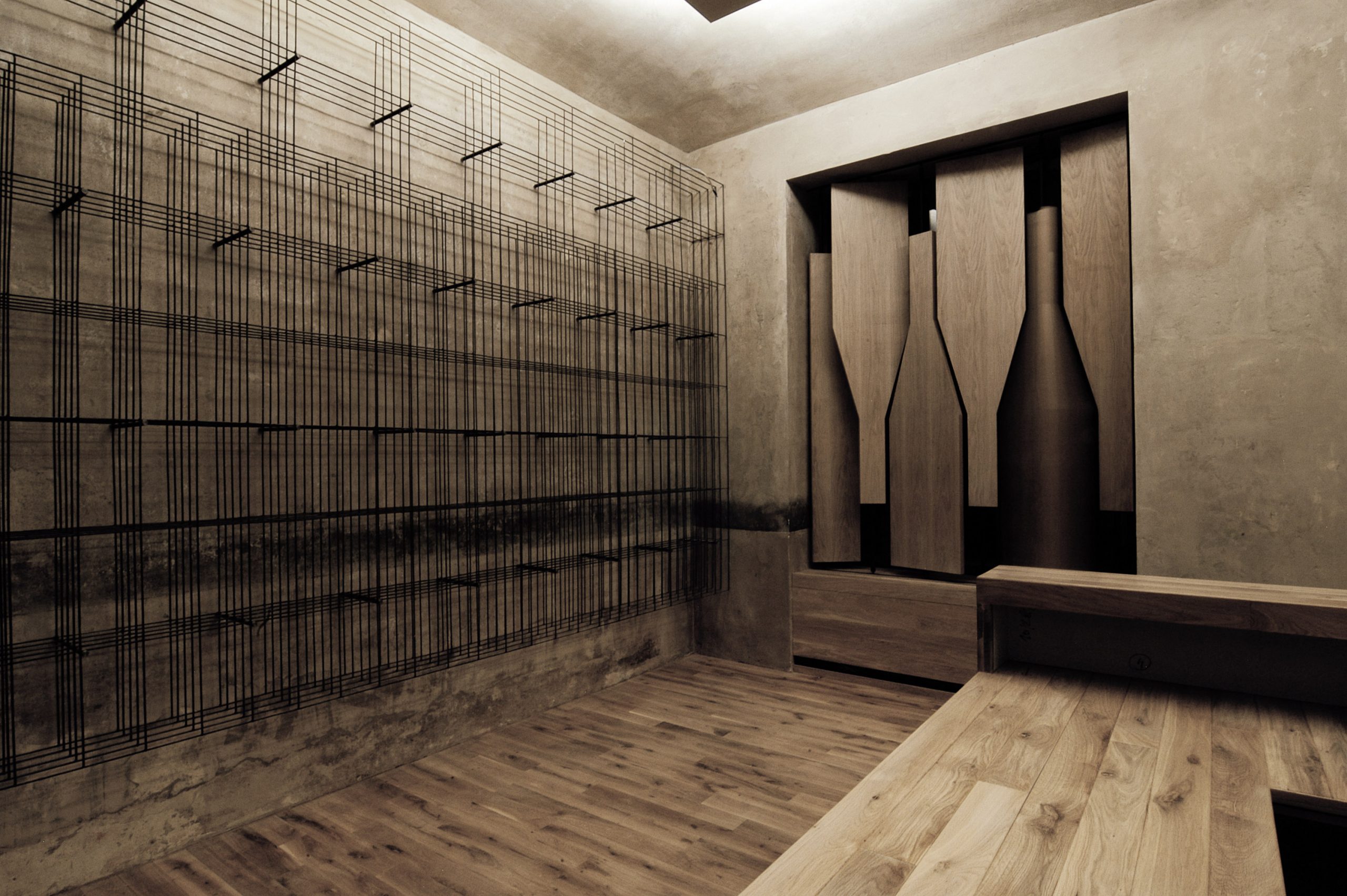
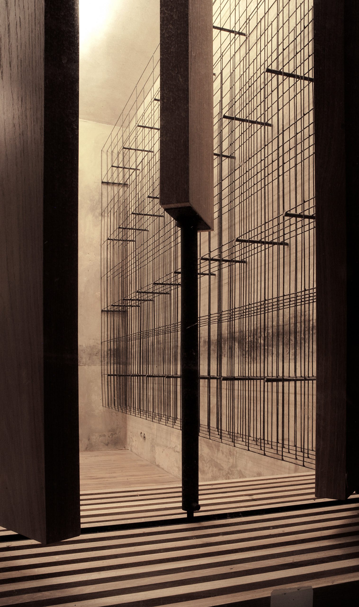
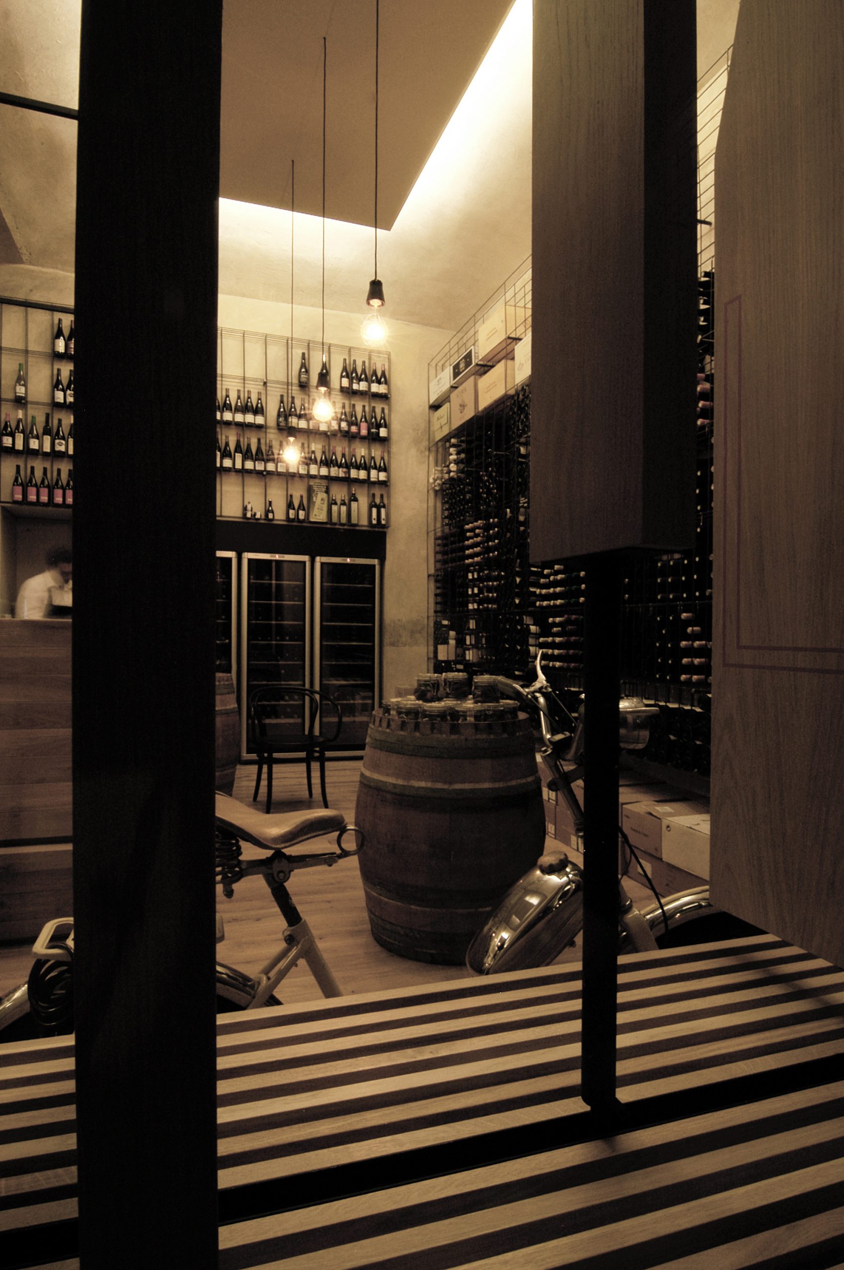
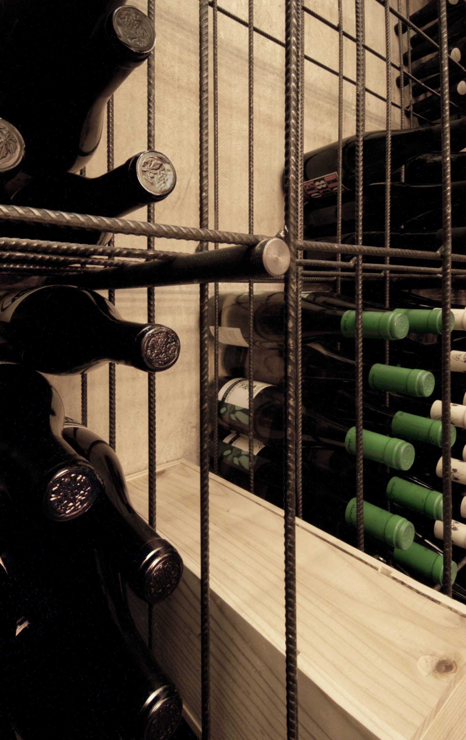
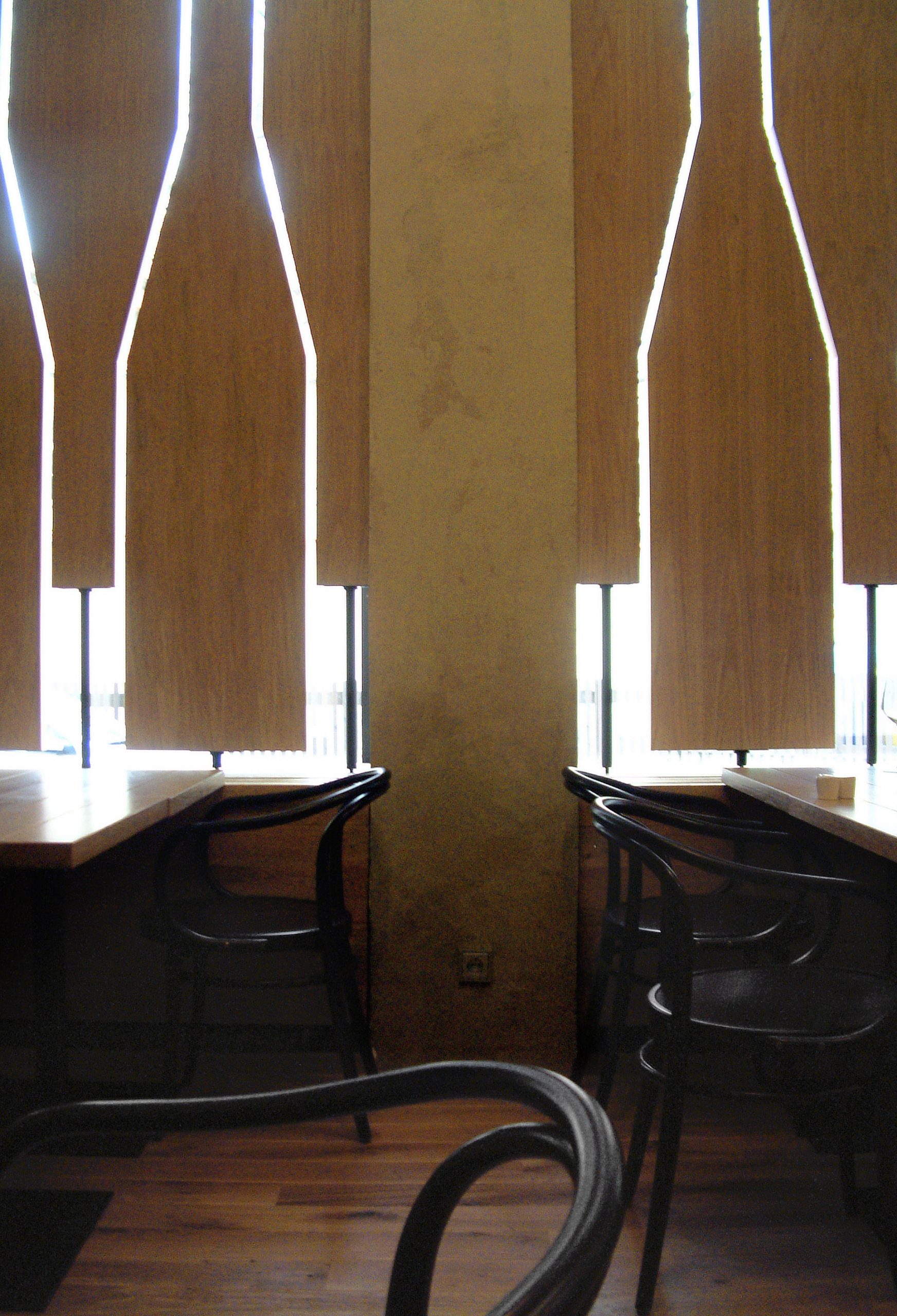
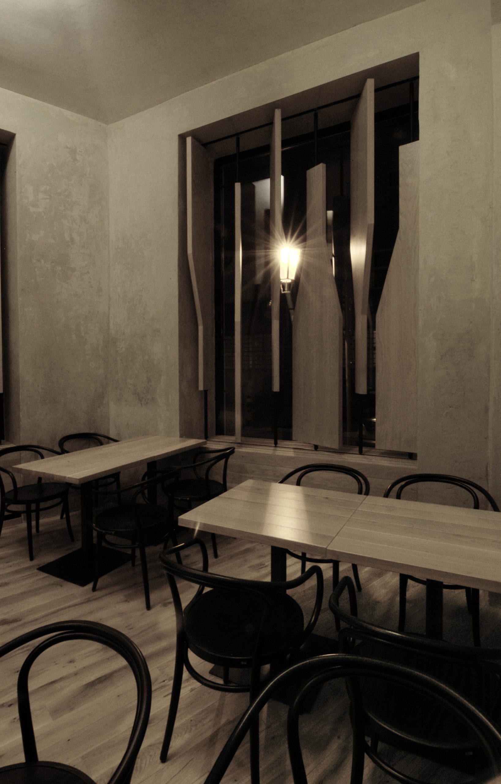
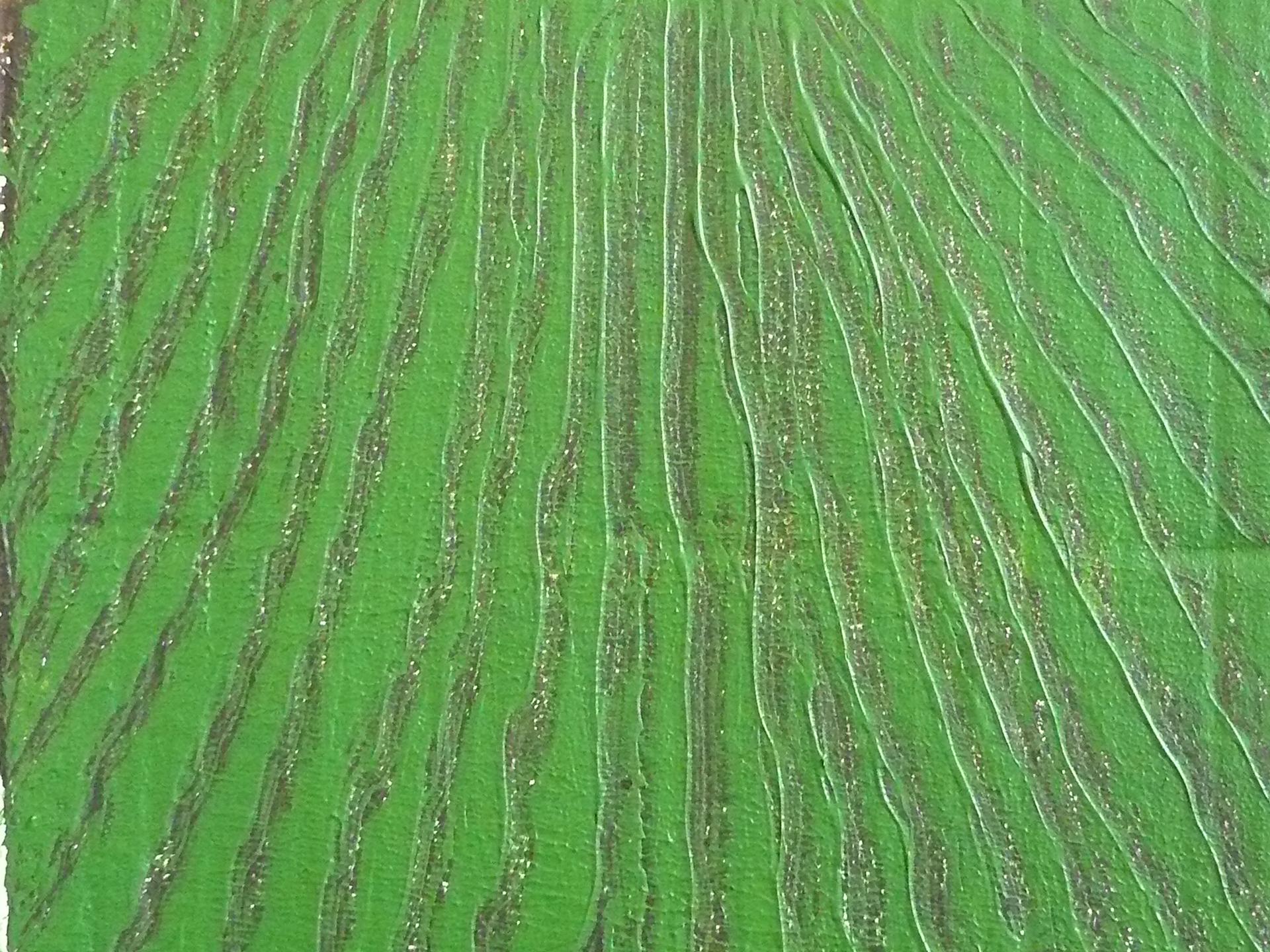
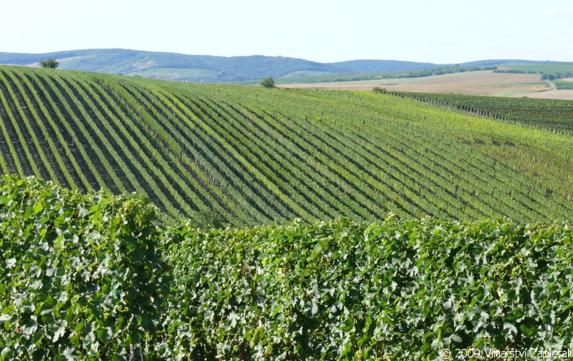
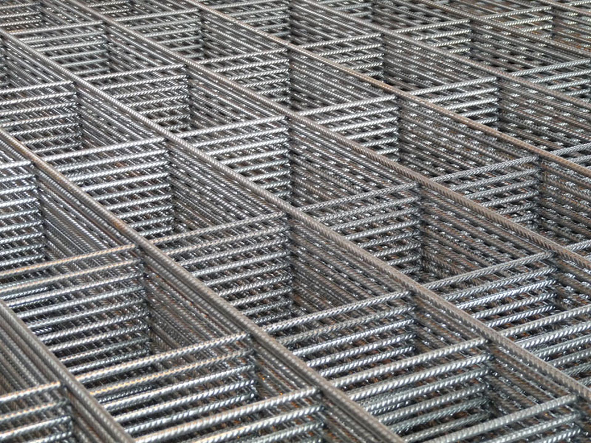
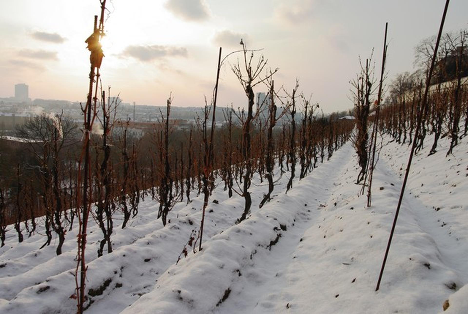
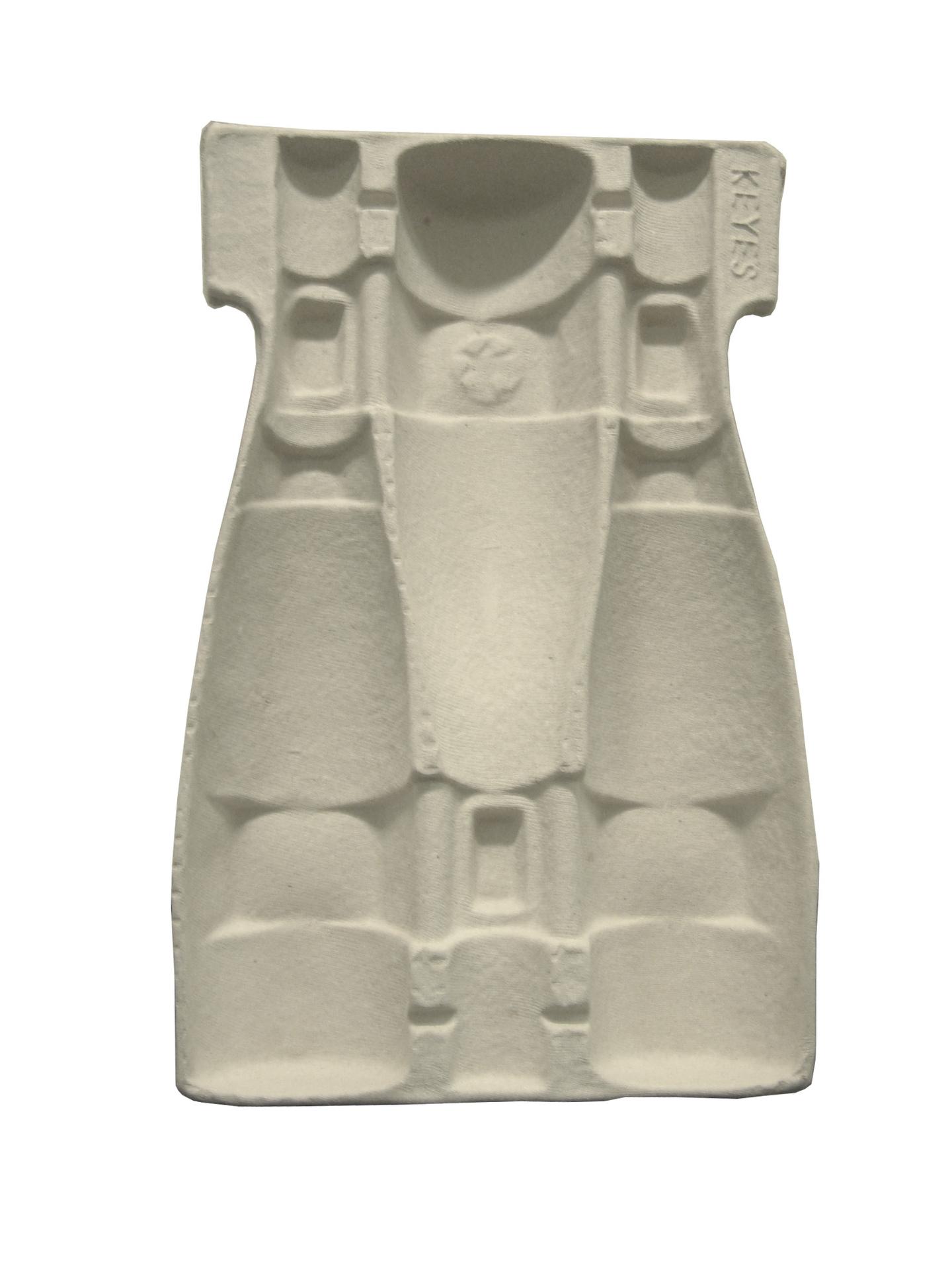
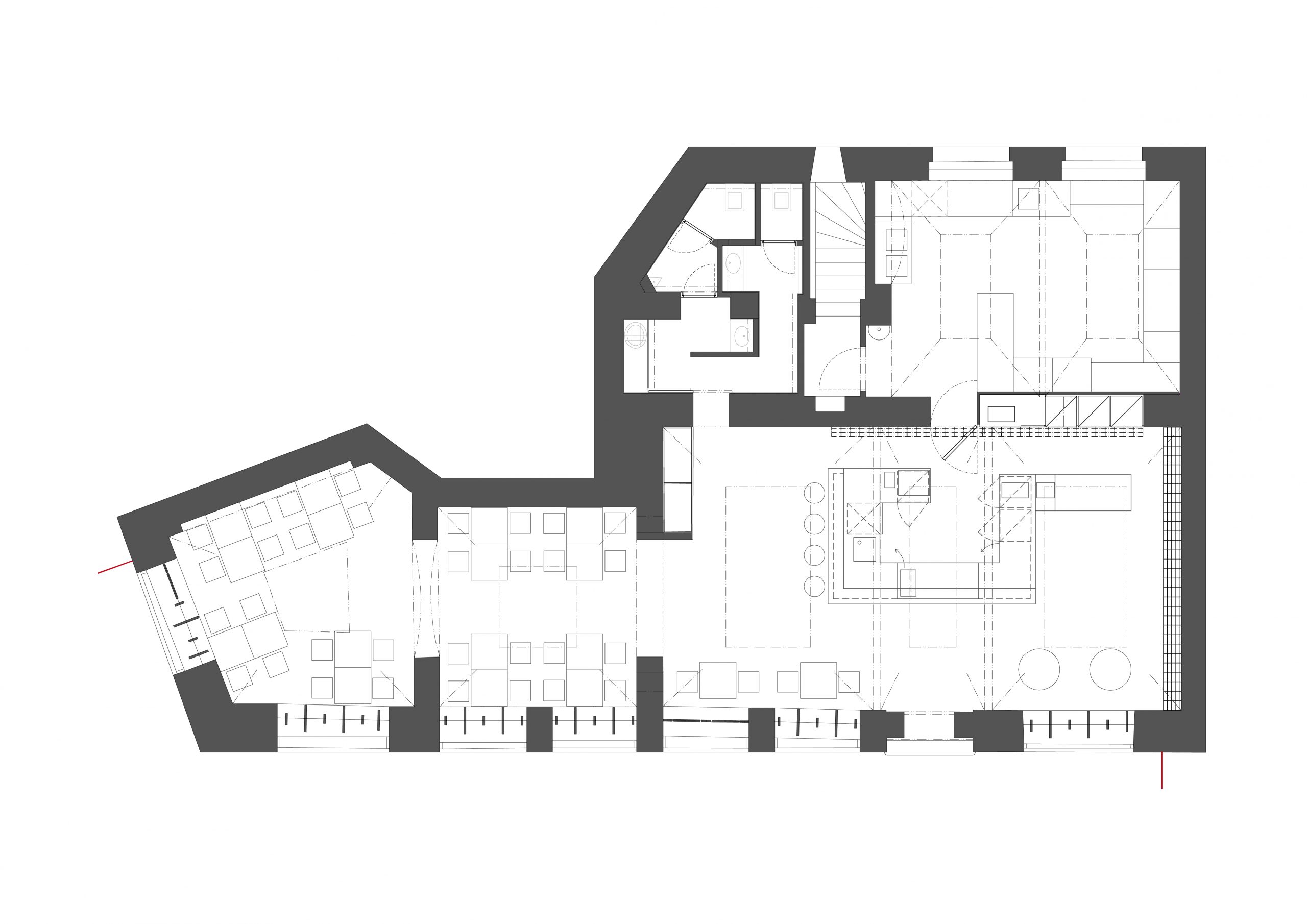
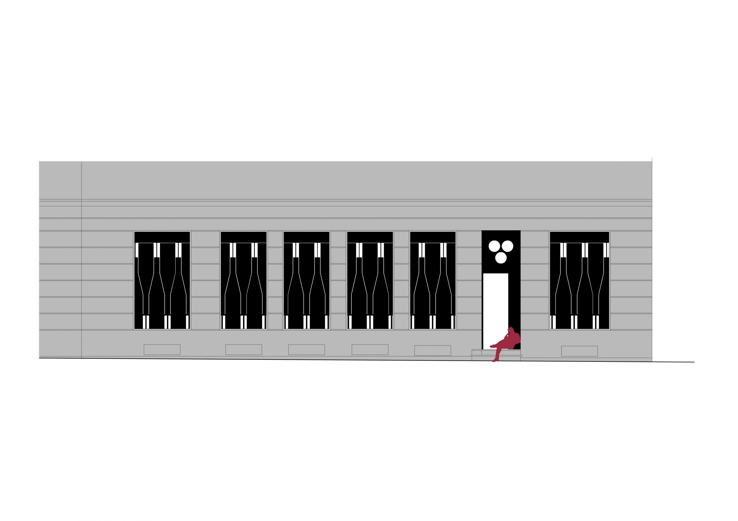
When the client approached us with an offer to design this interior I asked myself a question whether I could at all accept such a task. Should we linger upon it though I do not understand the atmosphere of cool restaurants at all?Disliking their shallow visuality, not understanding the purpose why they are furnished with objects from among the most up-to-date design series used as a means to become authentic – this is no singularity at all! I communicated these doubts including (in my opinion) poor examples in this sense to the client at our every first meeting. We browsed through photographs of bars and small wine shops in France he brought me. As a source of inspiration, he said (though on the contrary to the thesis on modern restaurant). All of them spontaneously furnished rooms with the atmosphere given by the place and all those years their owners have been running them. I objected that only life could do this. Of course – la vie en France, life in France. And that this cannot be designed because it would be like artificial flavouring of wine – and would you drink artificially flavoured wines? I do not know now who of us used the term first, but it became the starting point of all our further reasoning – we agreed not to artificially flavour even the interior. It would contravene the character of natural wines they should sell in the wine shop. You have to find your way to these wines – only then you may fully enjoy them. And the same way we think about the interior of this way oriented restaurant – we put most of our effort to make our work invisible at first sight. Our interior should be a background allowing enjoy good wine and meal here and now. It is determined by materials related to viticulture processed by master craftsmen – oak wood for the floor and bar counter, and rebars (used in vineyards as poles supporting vine) for bottle shelves. The shelves disappear from view with the growing number of stores bottles and they transform in a wall of bottles. Simple removal of disturbing modifications on the ground floor in the 19th century house showed the authentic quality of these areas. After the impersonally cool paints were removed from walls the house’s history appeared – remnants of original paints and plasters mingle with scars caused by building modifications. Touching them, seeing their graphic quality is a unique experience. A painting called ´A Vineyard´ by Martina Chloupa (http://chloupa.blog.cz) complements all this. The existing shop windows provide contact with the exterior that is important for a restaurant in the city centre. However, we designed revolving screens resembling the means of storing wine bottles in boxes for evening wine tasting or private events. They allow the shop windows closed completely. A visitor than finds himself in a sort of a wine cellar, separated from the reality of the surrounding city. This moment is also emphasised by indirect lighting and dimmed bare light bulbs – the only visible light fixtures. The shop window does not become blind this way, but transforms in a large restaurant’s logo.
